AuraGen
Designing an investor-facing biotech brand where the interface has to earn the trust the brand is asking for.
On this page
The figures shown in the AuraGen screens are simulated.
The problem wasn’t credibility. It was how to demonstrate it.
Biotech has a particular communication challenge. The products are complex. The science can be difficult to explain. And the audience is being asked to make decisions based on information they often can’t directly verify.
A lot of investor-facing communication responds by doing the same thing: make the company look credible. Use the right language. Show the right imagery. Say “data-driven,” “rigorous,” “science-led.”
But a polished presentation is still a presentation. For AuraGen, I wanted to explore a different approach: what if the digital experience could demonstrate the company’s way of working instead of simply describing it?
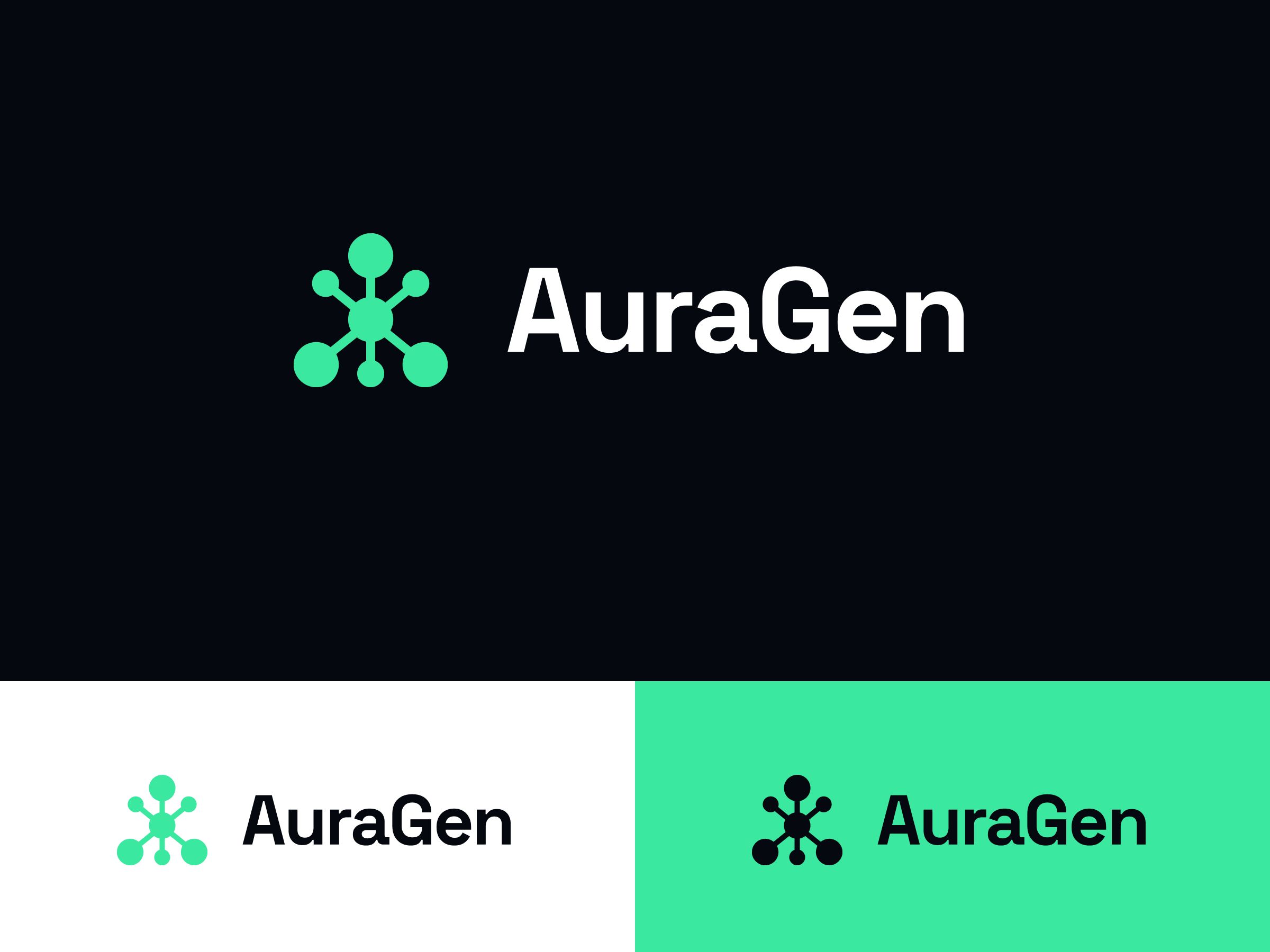
Start with the experience, not the claim.
That question changed the role of the website. Instead of building an investor site that points toward a product somewhere else, I made the product visible inside the experience itself.
At the centre of the site is an interactive laboratory dashboard showing simulated operational data. It’s not a screenshot pretending to be a product. It behaves like one.
The brand then had to support that idea. It needed to feel credible and technically grounded without falling into the look of generic “future science” – glowing gradients, stock molecular imagery and interfaces designed to look complicated simply because the subject is complicated. The challenge was to make the complexity feel understandable.
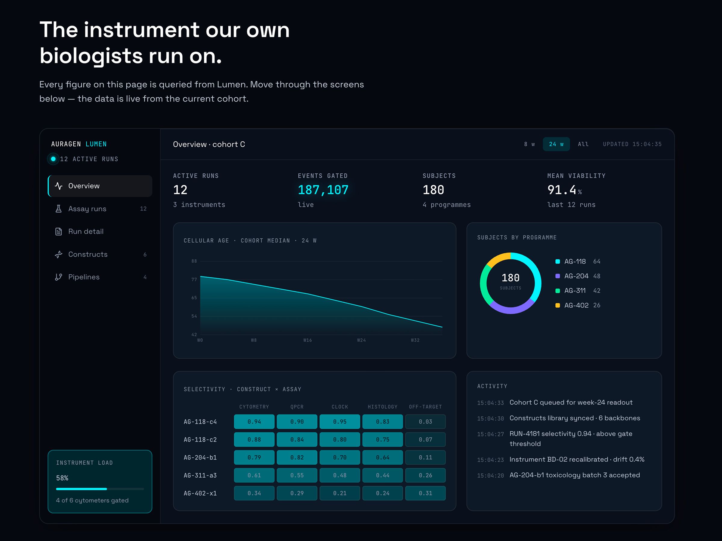
Don’t just explain how the company works. Let people see it working.
Build trust through what people can inspect.
The identity was designed to feel precise rather than clinical: restrained enough for investor communication, lively enough to live inside a product interface.
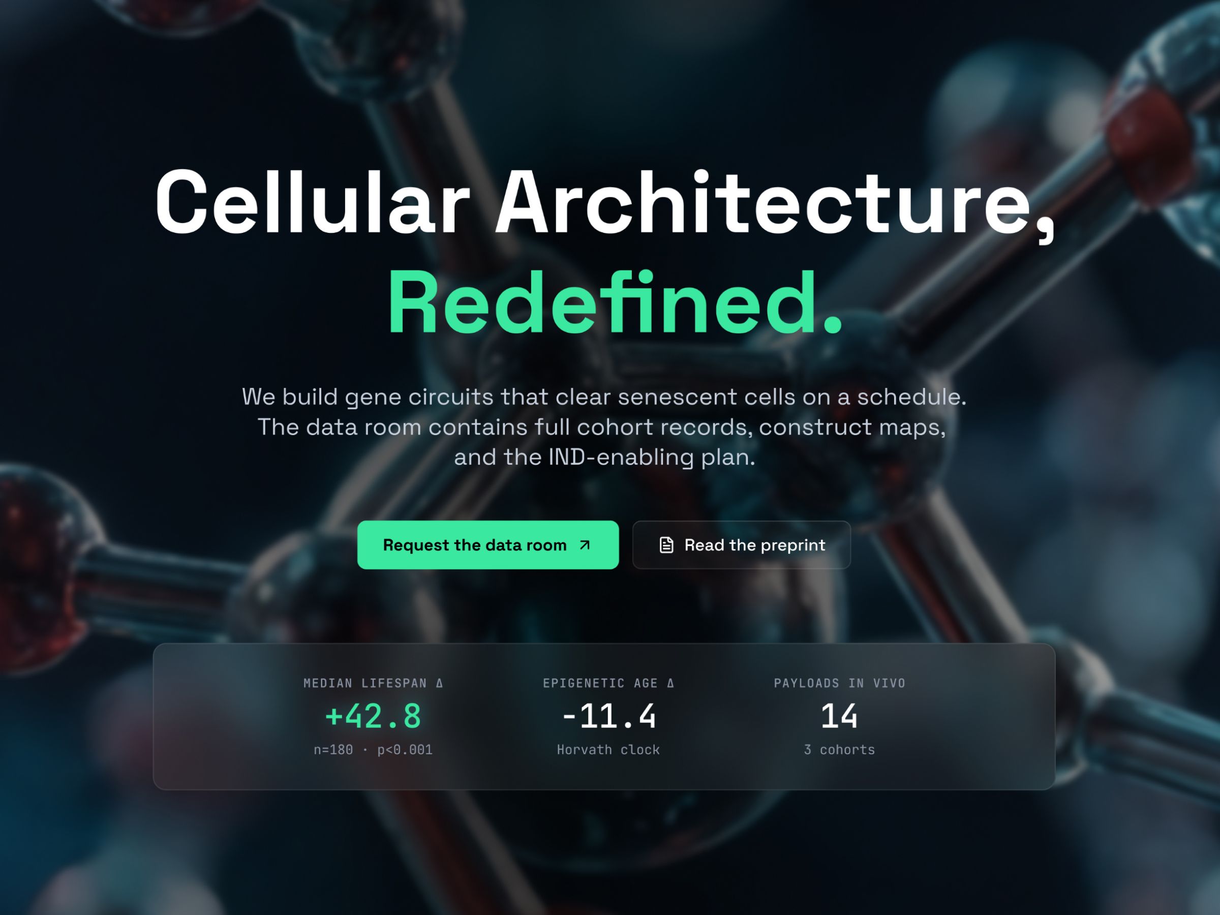
The website follows the same principle. Information is structured rather than overloaded. The interface creates hierarchy instead of visual noise. The dashboard becomes a central piece of evidence rather than a decorative screenshot.
The result is an investor experience that doesn’t just say we know what we’re doing. It gives the visitor something to inspect.
The interesting part was deciding where AI should not design.
AuraGen was also an experiment in my own workflow. I deliberately separated creative direction from production acceleration.
The core brand was established first using conventional design methods: concept development, sketching, typography, identity construction and interface thinking. Only after the foundations were clear did AI become part of the production pipeline – extending the system, exploring variations, accelerating production and helping turn the designed experience into a functioning website.
The distinction is important. I wasn’t asking “how much of this can AI make for me?” I was asking: where does AI give me leverage without taking over the decisions that make the work mine?
That meant keeping the important calls – what the brand should say, what it should feel like, how the system behaves, what deserves emphasis and what should be removed – under human direction.
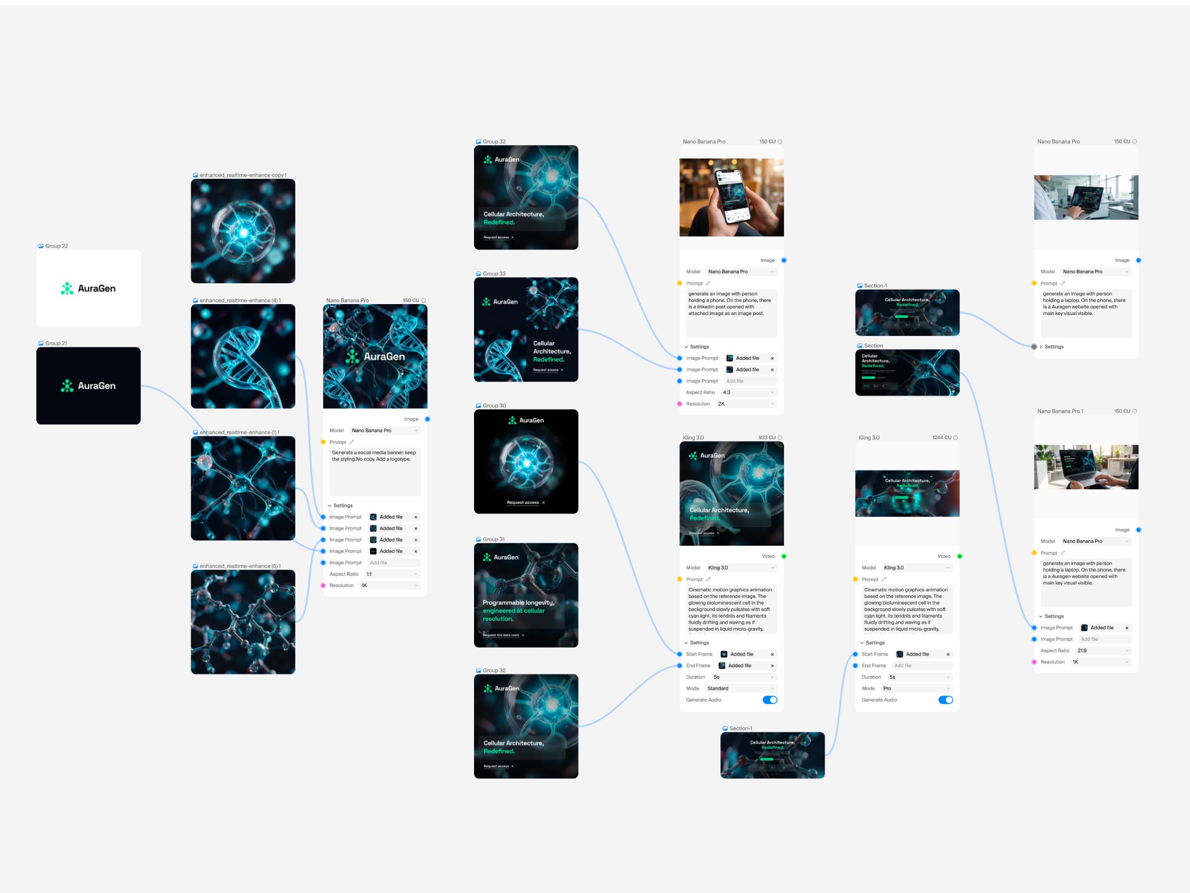
AI handled acceleration. Design handled intent.
One system instead of a collection of screens.
The project was designed as a connected system from the beginning. The identity informs the website. The website informs the product interface. The product interface makes the proposition tangible. The same visual logic carries across all three.
That connection was important because the project isn’t really a branding exercise followed by a website. It’s one idea expressed at different levels: brand → interface → product. The identity establishes credibility, the website creates the narrative and the dashboard demonstrates the proposition.
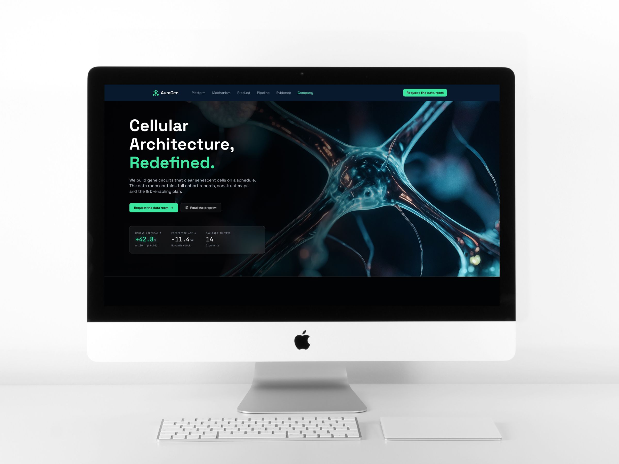
What I built.
The identity
Naming, logotype, typography, visual language and core design principles.
An investor-facing website
Information architecture, UX/UI, responsive layouts and a full interface system.
A working product experience
An interactive laboratory dashboard using simulated operational data.
An AI-assisted production workflow
Traditional design methods combined with generative and AI development tools at specific stages of the process.
The goal wasn’t to produce three impressive-looking deliverables. It was to make them feel like they came from the same company.
The whole pipeline, without flattening the thinking.
It doesn’t just show what I can make. It shows how I think about making it. AuraGen became my test of a question I think is becoming increasingly important in design: can a designer use AI across an entire creative pipeline without letting the tools flatten the thinking?
The project moves from strategy to identity, identity to interface, interface to working product – with AI used where it created leverage and conventional design methods used where judgment mattered most.