The challenge: the problem with corporate values.
Ambition. Collaboration. Accountability. The usual corporate vocabulary. The problem with these words isn’t that they are wrong; it’s that they are too generic to ever become part of everyday conversation. When values live strictly as abstract nouns on a boardroom wall, nobody actually owns them.
The concept: from adjective to action.
Instead of trying to describe a company value, I wanted to give people a tangible attitude. That attitude was distilled down to a single, actionable verb: DO.
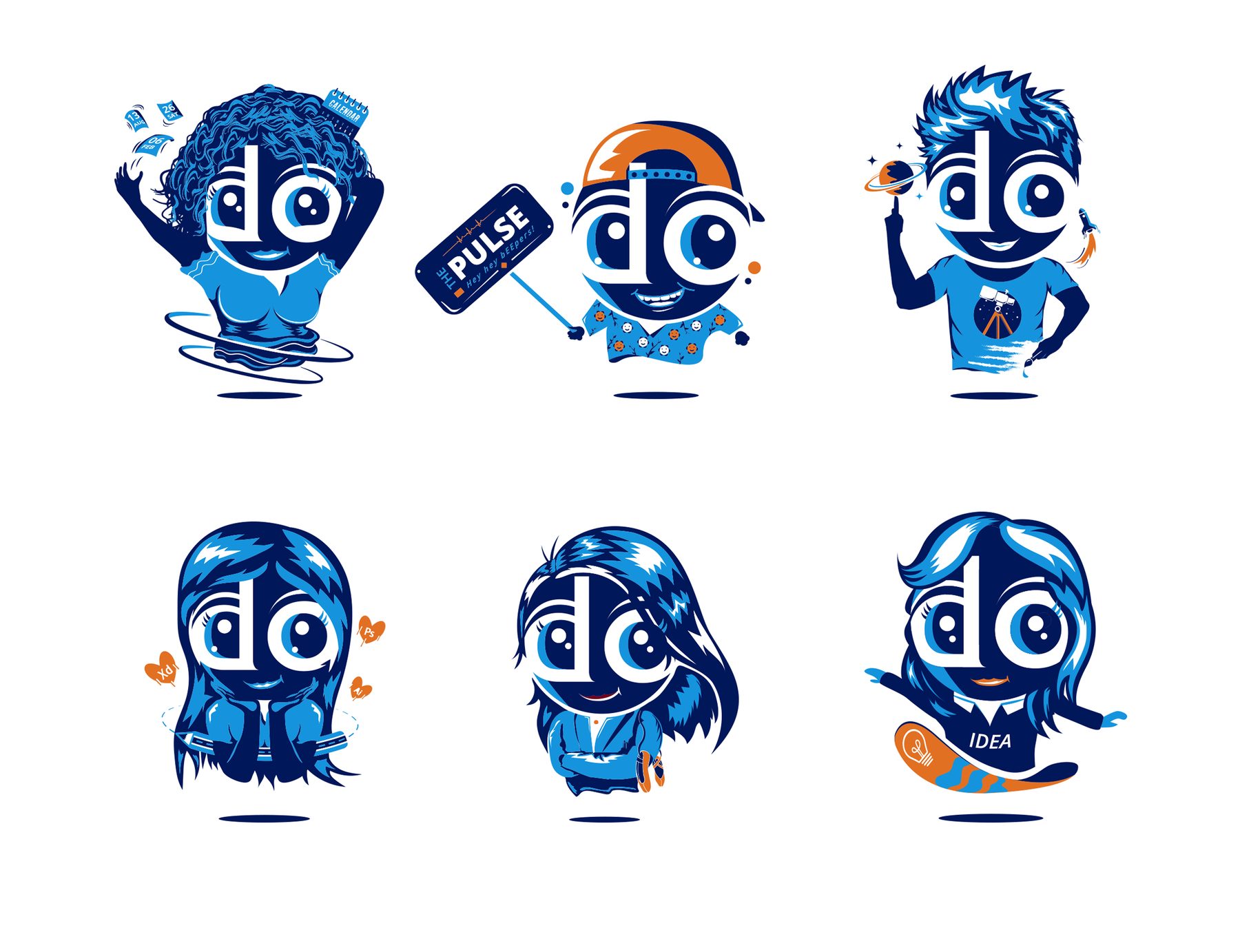
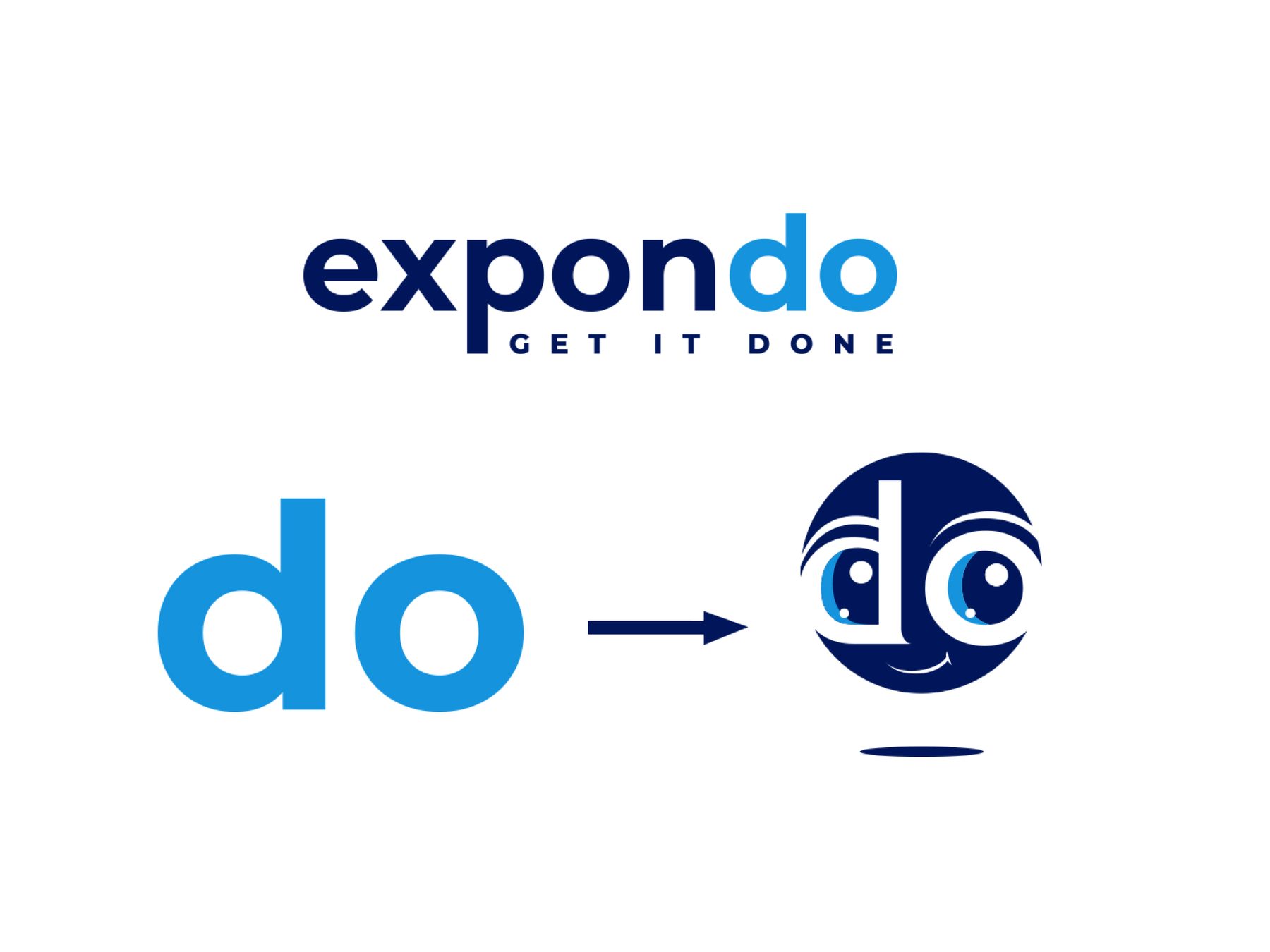
To make it stick, it needed a face. The existing “DO” mark within the Expondo logo became the conceptual starting point. Rather than inventing something foreign to the brand, I extracted a piece of its core visual identity and turned it into a living, reactive character that could actually communicate, rather than just sit statically on a poster.
A value nobody can say out loud isn’t much of a value.
Art direction: giving culture a character.
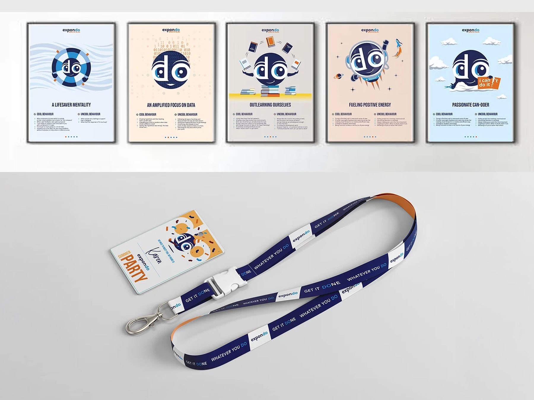
The DOer was developed from rough pencil sketches through to final 2D animation, eventually scaling across workplace posters, print collateral, and digital internal communication channels.
Tonally, the character had to walk a very specific line. It needed to be playful enough to be approachable and memorable, but it had to remain grounded in the existing Expondo identity – a company built around heavy equipment, real tools, and real work. It couldn’t feel like a cartoon distraction; it had to feel like a visual extension of the workforce.
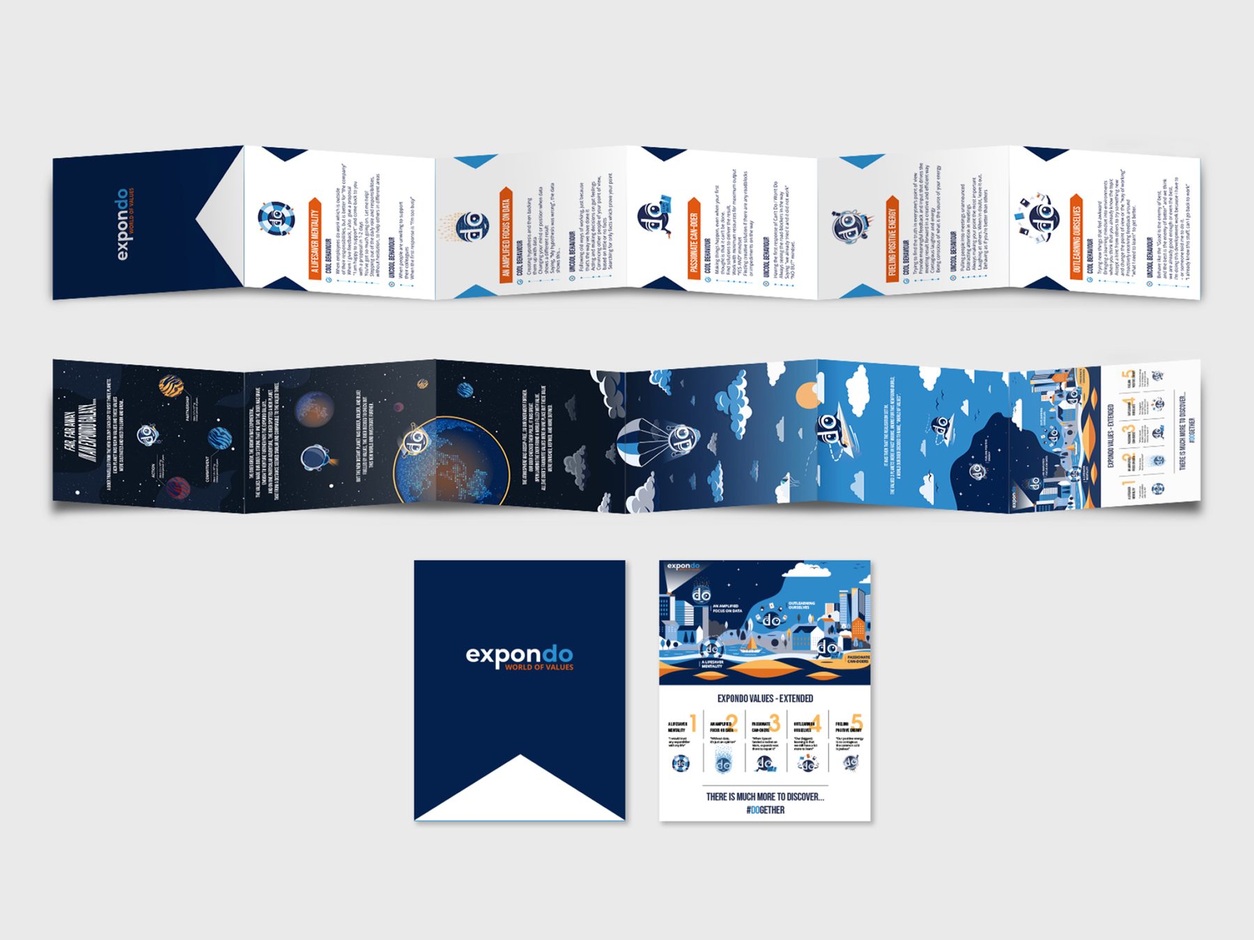
Applications: a voice for internal communication.
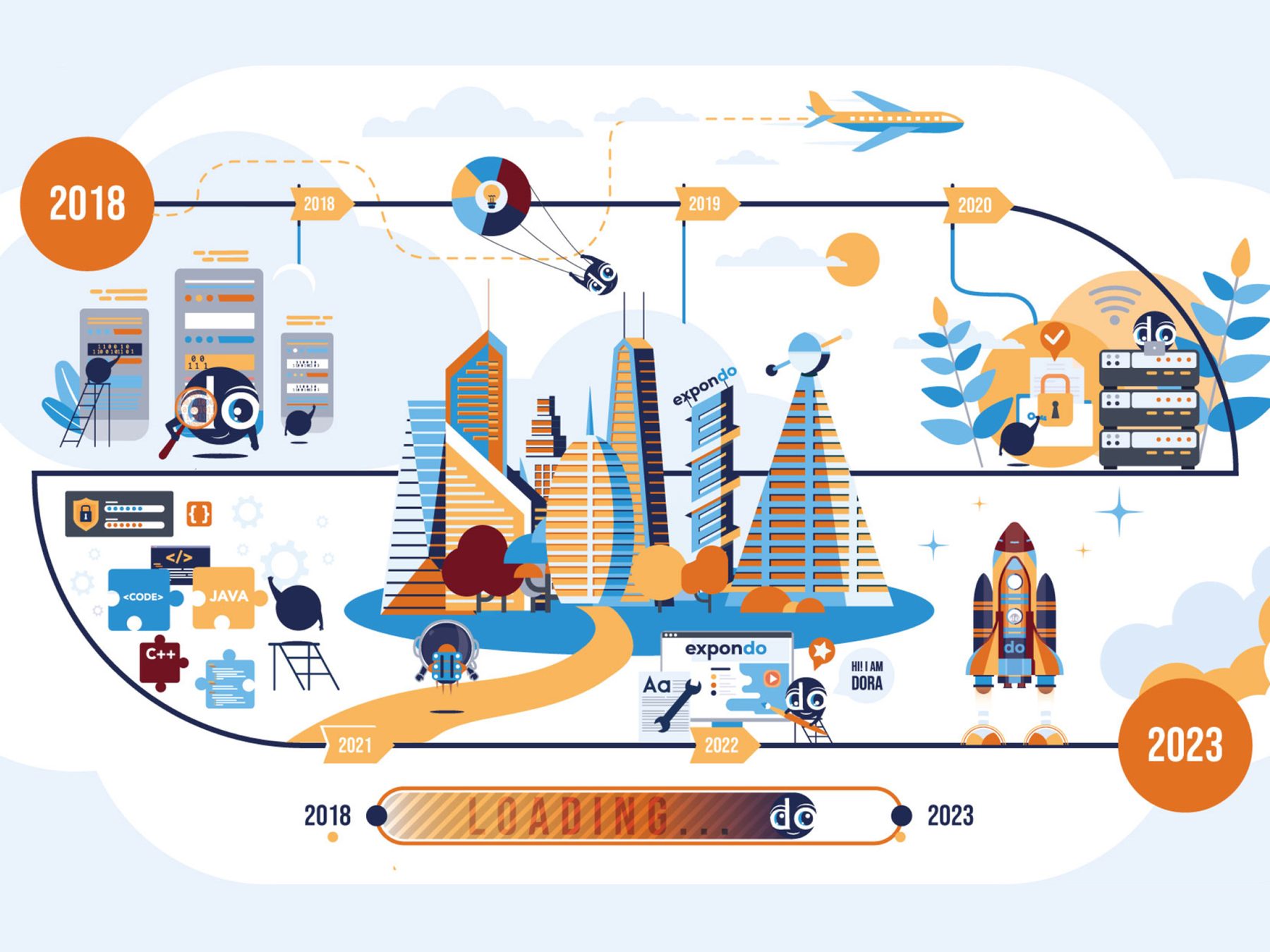
An abstract list of corporate values became one word people could actually use. The DOer was designed for company announcements, employee onboarding, presentations and organizational updates.
The point was never the mascot. It was giving the company a voice people recognize in an announcement, an onboarding deck or a poster on the wall.