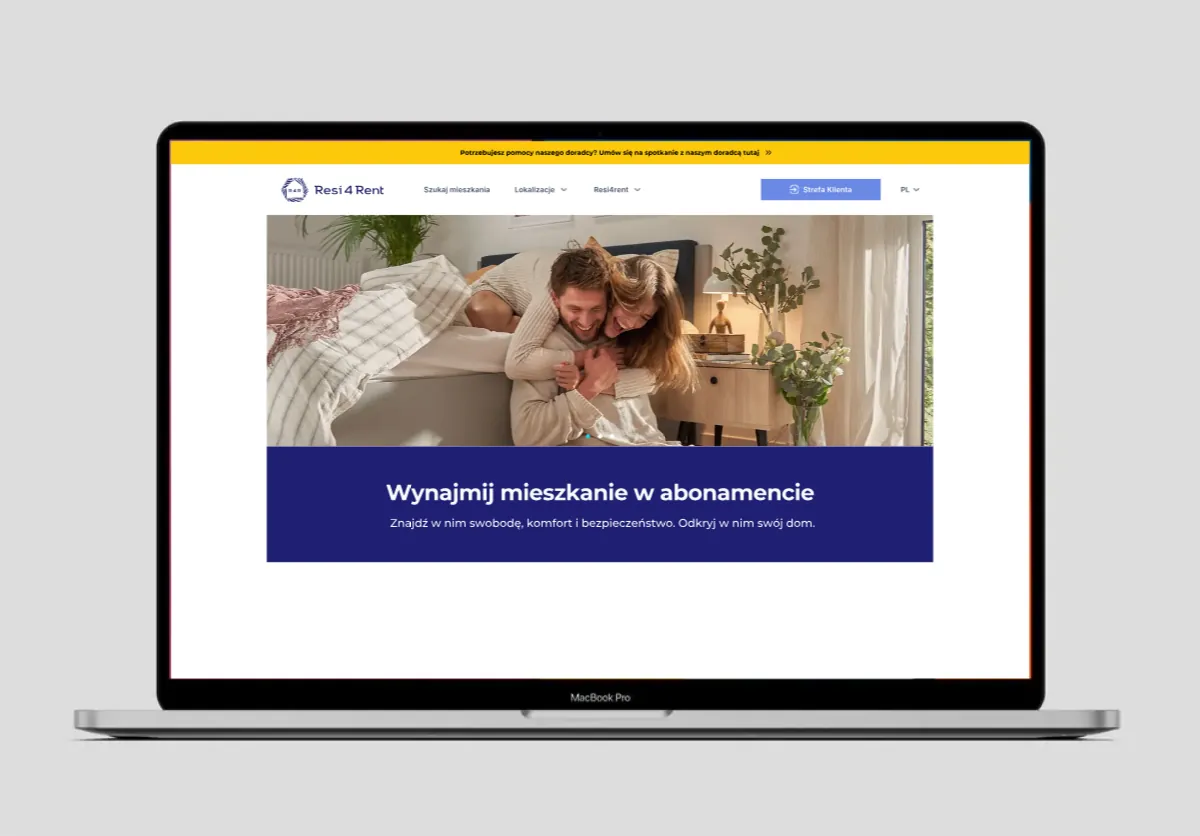
Resi4Rent
Turning a rental website into a journey people could actually navigate.
The problem wasn’t finding a home. It was finding the next step.
Resi4Rent already had a strong proposition: a subscription-based rental model designed to make moving easier. The old website didn’t make that promise particularly easy to experience.
It led with a slogan and a mascot, while the actual rental journey – finding a city, exploring an area, choosing an apartment and getting in touch – sat several layers deeper. As the offer expanded to include more cities, amenities and selling points, the structure underneath it had not really kept up. The first question, then, wasn’t how should the new website look? It was why weren’t people getting to the thing they actually came for?
Research changed the brief.
I started with surveys, interviews, analytics, heuristic evaluation and competitor research, looking at both the existing experience and the behaviours surrounding it. The signals were hard to ignore.
The offer itself wasn’t the obvious problem. The path to it was.
The website was organised around Resi4Rent. It needed to be organised around the decision.
That distinction changed the project. The deeper I went into the research, the more the same pattern appeared: users weren’t looking for a company’s structure. They were trying to answer a very practical sequence of questions.
City
Where do I want to live?
Area
Which area works for me?
Apartment
Which apartment fits?
Contact
How do I move forward?
That became the foundation of the new information architecture: City → Area → Apartment → Contact. Instead of treating search as one feature among many, I made it the centre of the experience.
From browsing to deciding.
To keep the work grounded in an actual user rather than a generic “renter”, I mapped the journey around a young professional relocating to Warsaw for work. The persona was less important as a fictional character than as a way of making the task concrete: limited time, specific practical criteria, a need for neighbourhood information and very little patience for navigating a confusing booking flow.
That led to a simple task flow: Homepage → City → Area → Apartment → Contact. Every screen had to help the user get closer to a decision. This also changed what deserved attention in the interface. Search, filtering, location context and clear calls to action were prioritised over secondary content that might be useful later but wasn’t helping someone choose a home now.
The competitor research confirmed the direction. Looking at Vantage Rent and LifeSpot wasn’t about copying what they were doing well. It was about understanding what users had already learned to expect from the category: strong property imagery, useful filtering, clear information and a booking process that doesn’t make people stop and think about how to use it. The opportunity for Resi4Rent was to combine those expectations with something the old experience lacked: a clearer sense of progression and trust.
So the interface starts where the decision starts.
On desktop, the search bar became a primary interaction rather than a supporting element, with the neighbourhood map brought into the experience as a way of understanding not just an apartment, but its context. The application flow was simplified as well, with clearer calls to action and more deliberate trust signals placed throughout the journey.
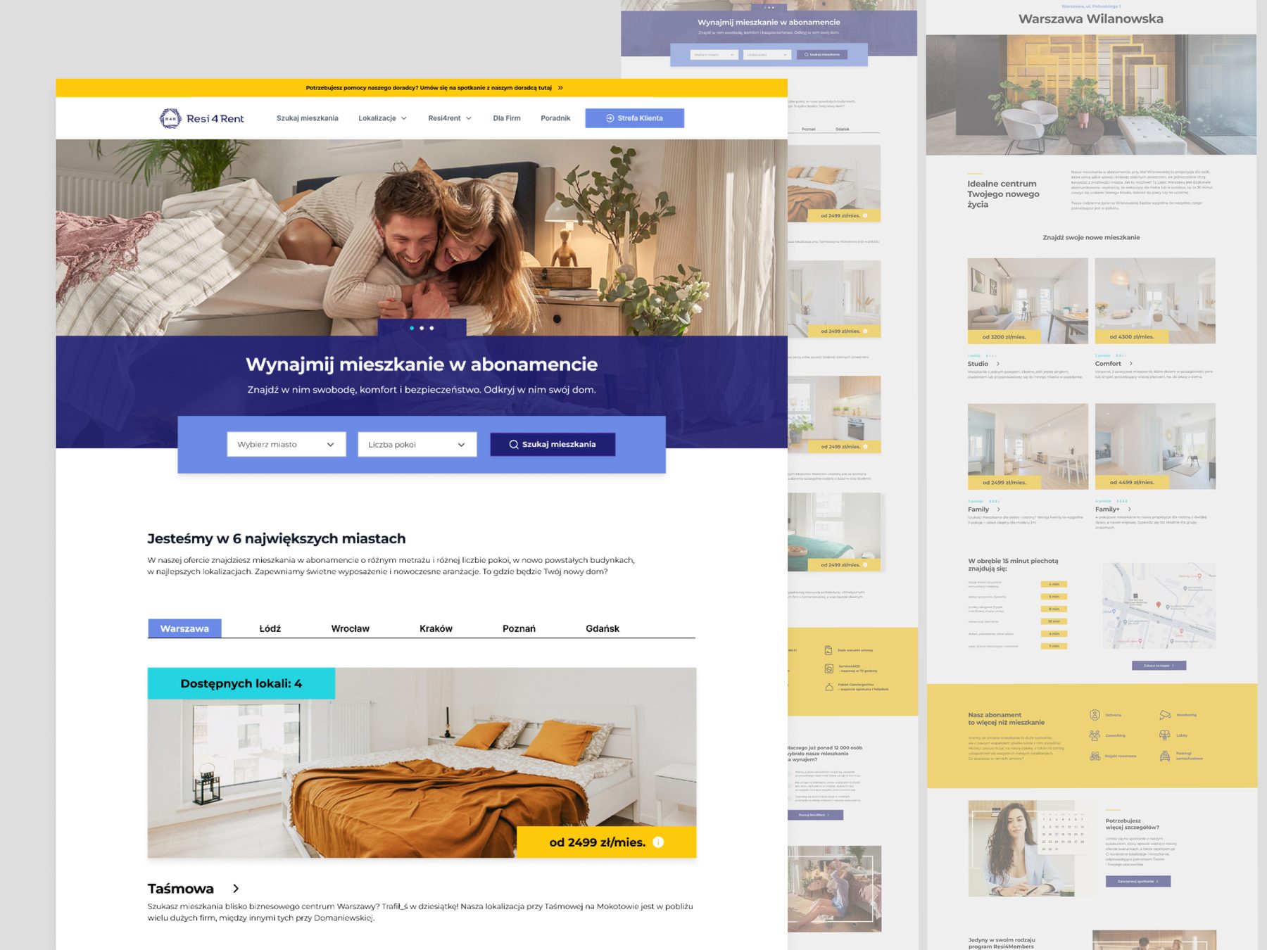
The goal was not to make the website look more sophisticated. It was to make the process feel easier than it did before.
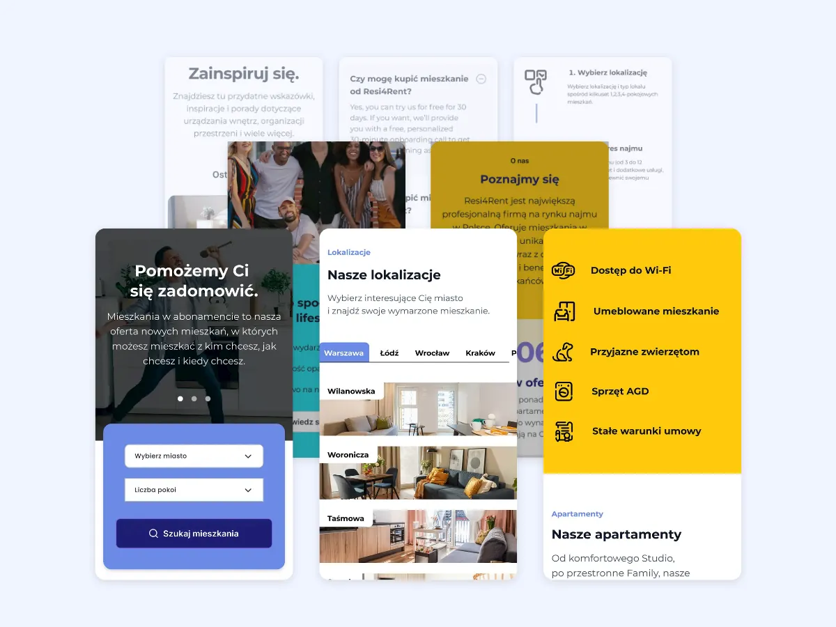
The mobile experience wasn’t an adaptation. It was a rethink.
One of the clearest findings in the research was the weakness of the previous mobile experience, with 90% of respondents identifying mobile responsiveness as an issue. So rather than shrinking the desktop experience down, I rebuilt the mobile journey around the behaviours that mattered most: searching, filtering, understanding location, comparing options and taking the next step. Search, filtering, location, map and proximity to amenities were treated as part of the core product experience. The result is a mobile experience that can carry the journey from discovery to contact without asking the user to switch context.
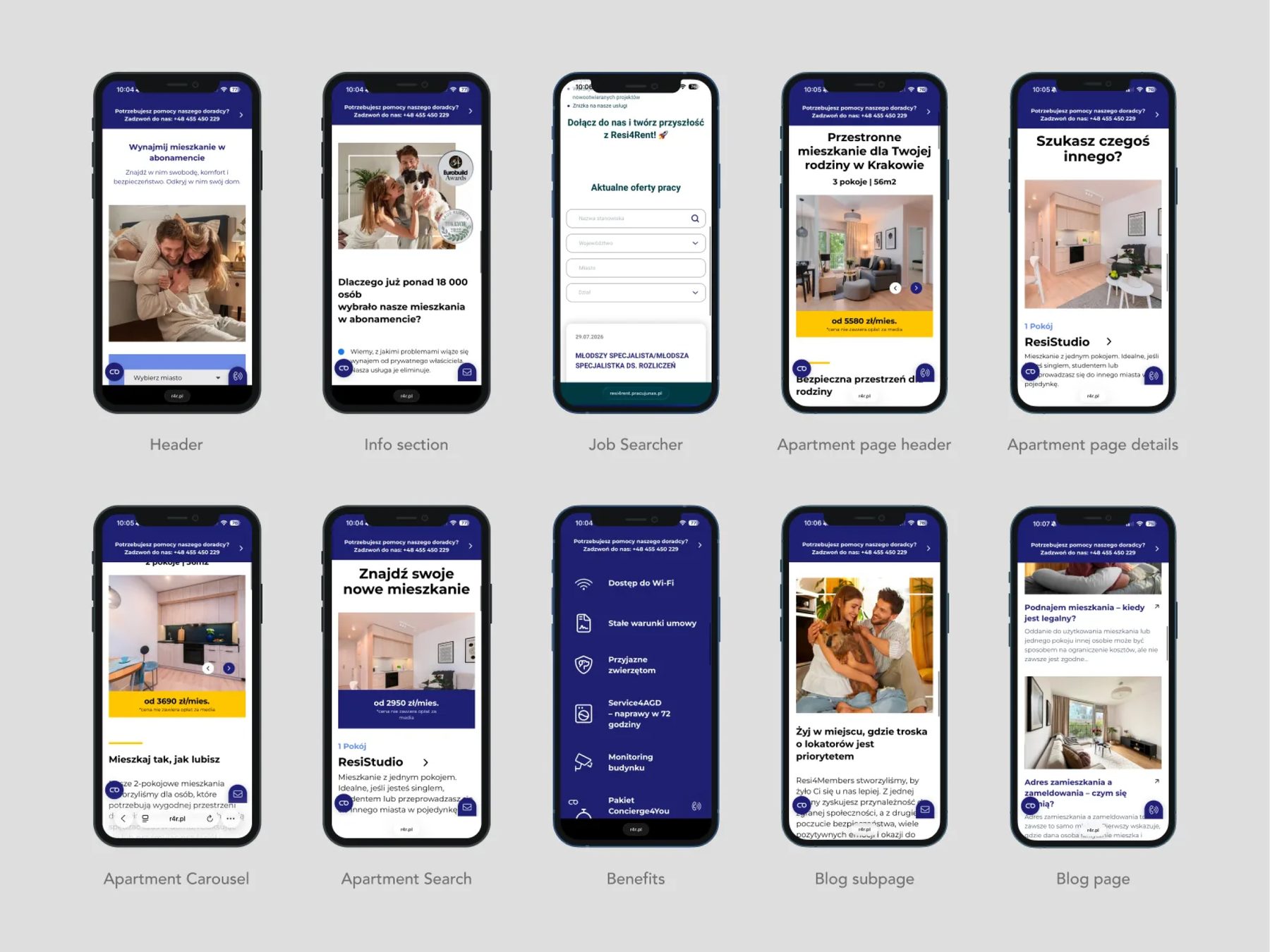
A design system built for the next city.
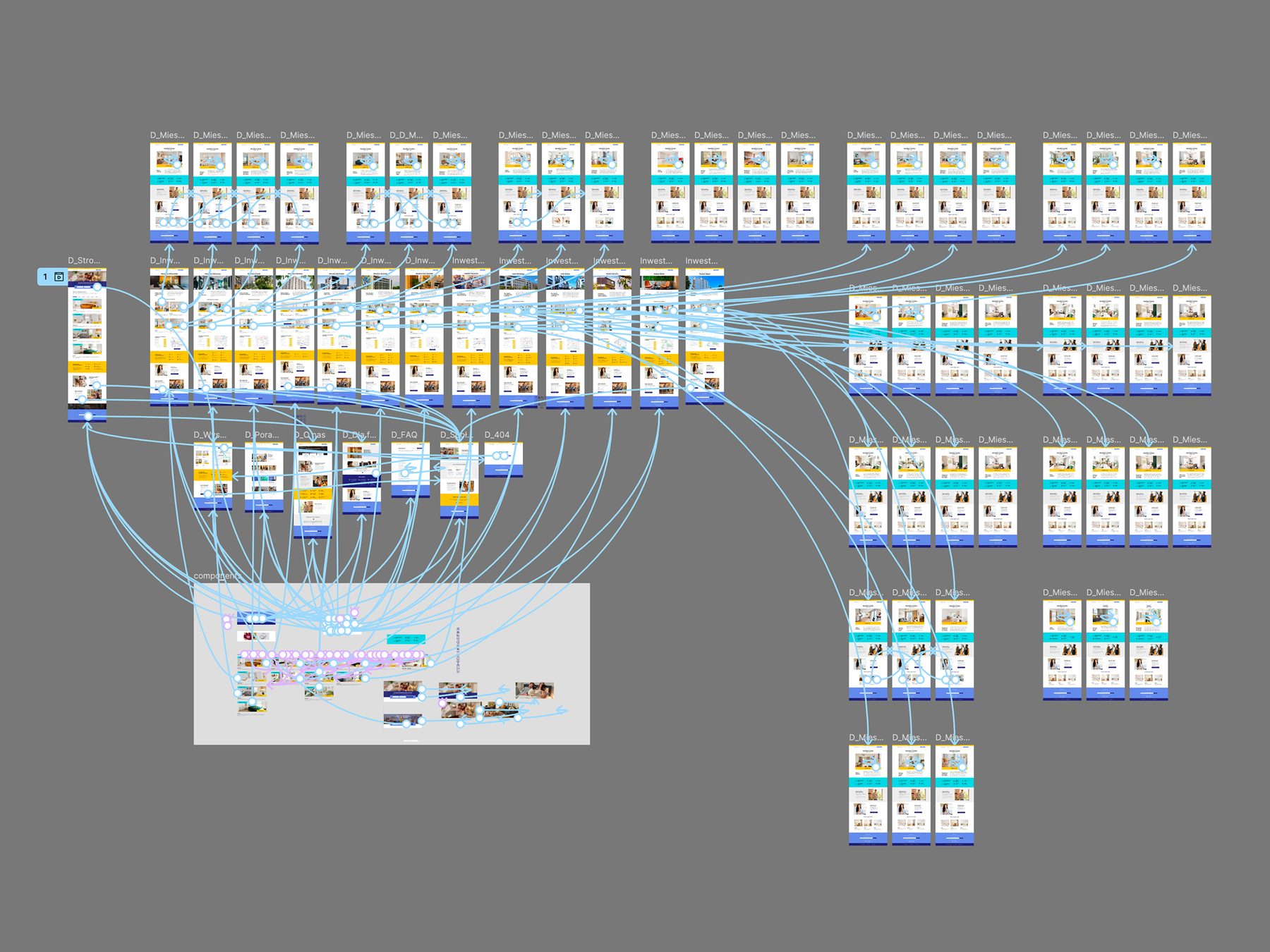
The redesign also needed to survive growth. Resi4Rent wasn’t going to stop at one city, one neighbourhood or one set of properties, so the interface couldn’t depend on individual page designs being recreated from scratch.
I built the experience around a mobile-first system that could support new cities, offers, properties and features without requiring the entire website to be redesigned each time. That was an important shift in thinking: the project wasn’t just a redesign of a website. It was the design of a framework for a growing service.
The result.
The website now leads with the things the research told us mattered most: search, filtering, property information and location. The journey from homepage to contacting an agent has been reduced to a clear sequence instead of sending users through disconnected parts of the site, while the mobile experience now supports the same core journey as desktop.
The biggest change, however, is harder to capture in a screenshot. The old website asked users to figure out how Resi4Rent worked. The new one is designed to walk them through the decision.