The Rennes SB website redesign aimed to enhance user experience, improve readability, and create a more cohesive visual identity. The previous website had usability challenges, an inconsistent design, and an overwhelming color palette. The goal was to redefine the UX journey, simplify navigation, and introduce a fresh, unified layout that aligns with modern web standards and the school’s brand.
8. Rennes School of Business

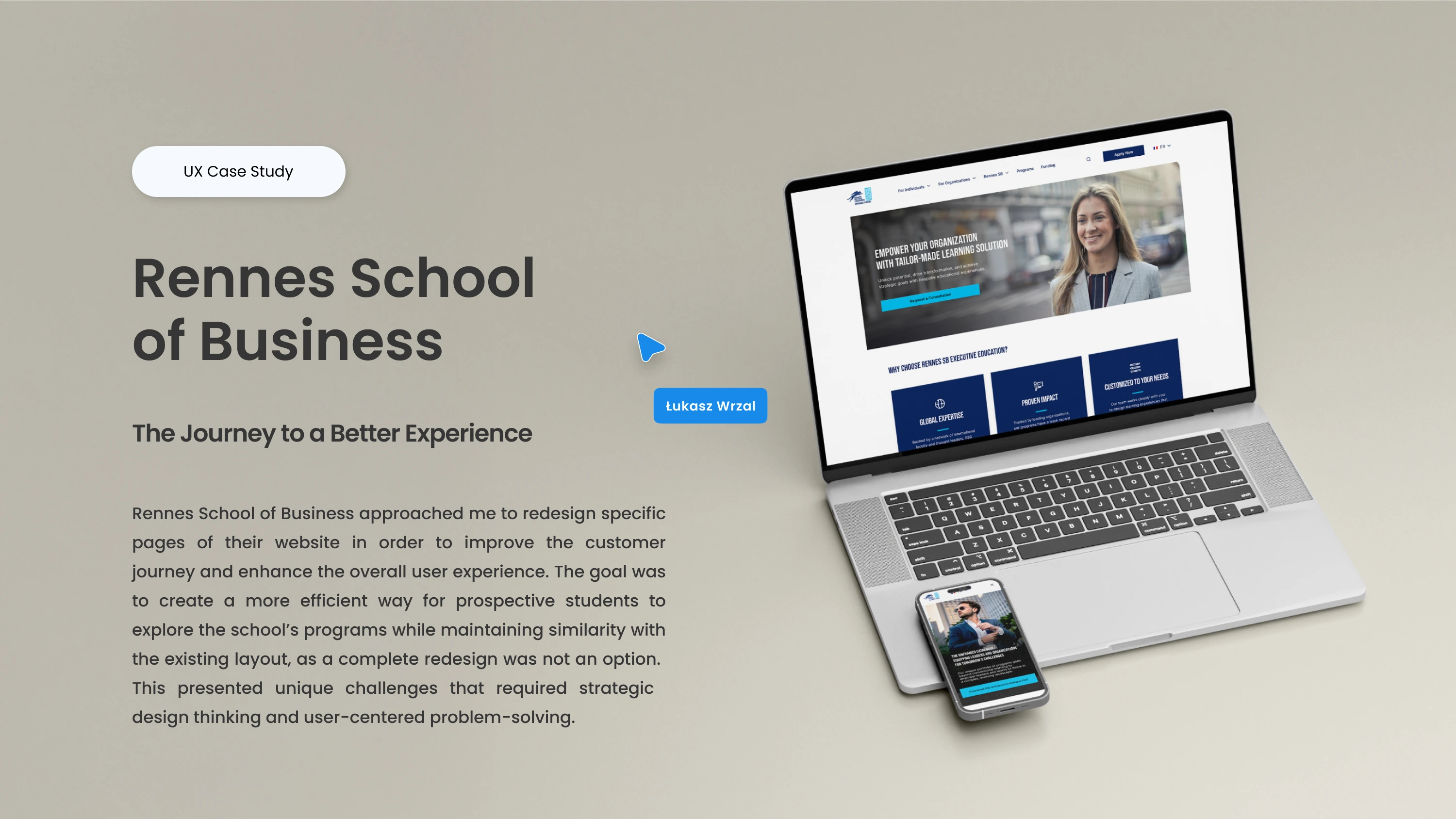
The project began with an in-depth analysis of user behavior, identifying key pain points in navigation and readability. A user-centered approach guided the design process, ensuring that content was structured logically and interactions were intuitive. The redesign focused on reducing cognitive load, refining typography for better legibility, and introducing a clear information hierarchy. The strategic use of whitespace and a reduced color palette further enhanced the visual experience.

.webp)
.webp)

Beyond design, significant technical improvements were implemented to enhance usability. Key pages were made fully responsive, ensuring a seamless experience across all devices. The filtering system was redesigned for a more efficient and intuitive way to browse programs. Accessibility was also a key focus, optimizing contrast ratios and text readability. Additionally, the new structure allows for easier content updates, making the website more scalable for future needs.


