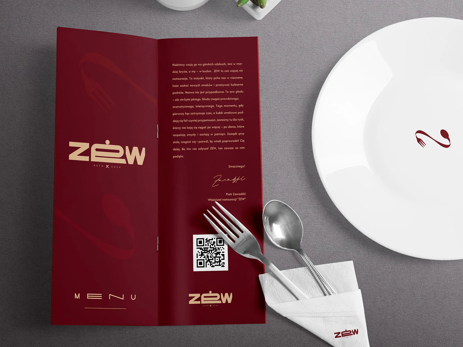
The challenge: reconciling dual personalities.
ZEW had two very distinct personalities to reconcile. One side of the brand was raw and primal; the other was refined and contemporary. Early design explorations leaned too far in one direction or the other. The challenge was to build an identity capable of holding both of these opposing forces in tension, without falling back on tired restaurant industry clichés.
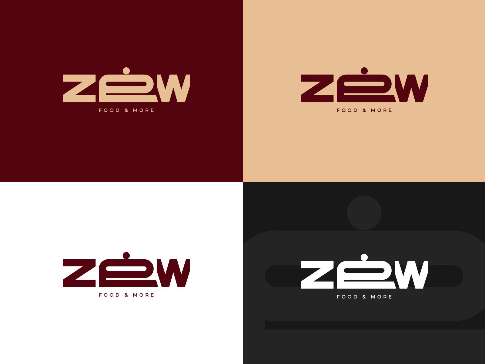
The concept: the hidden cloche.
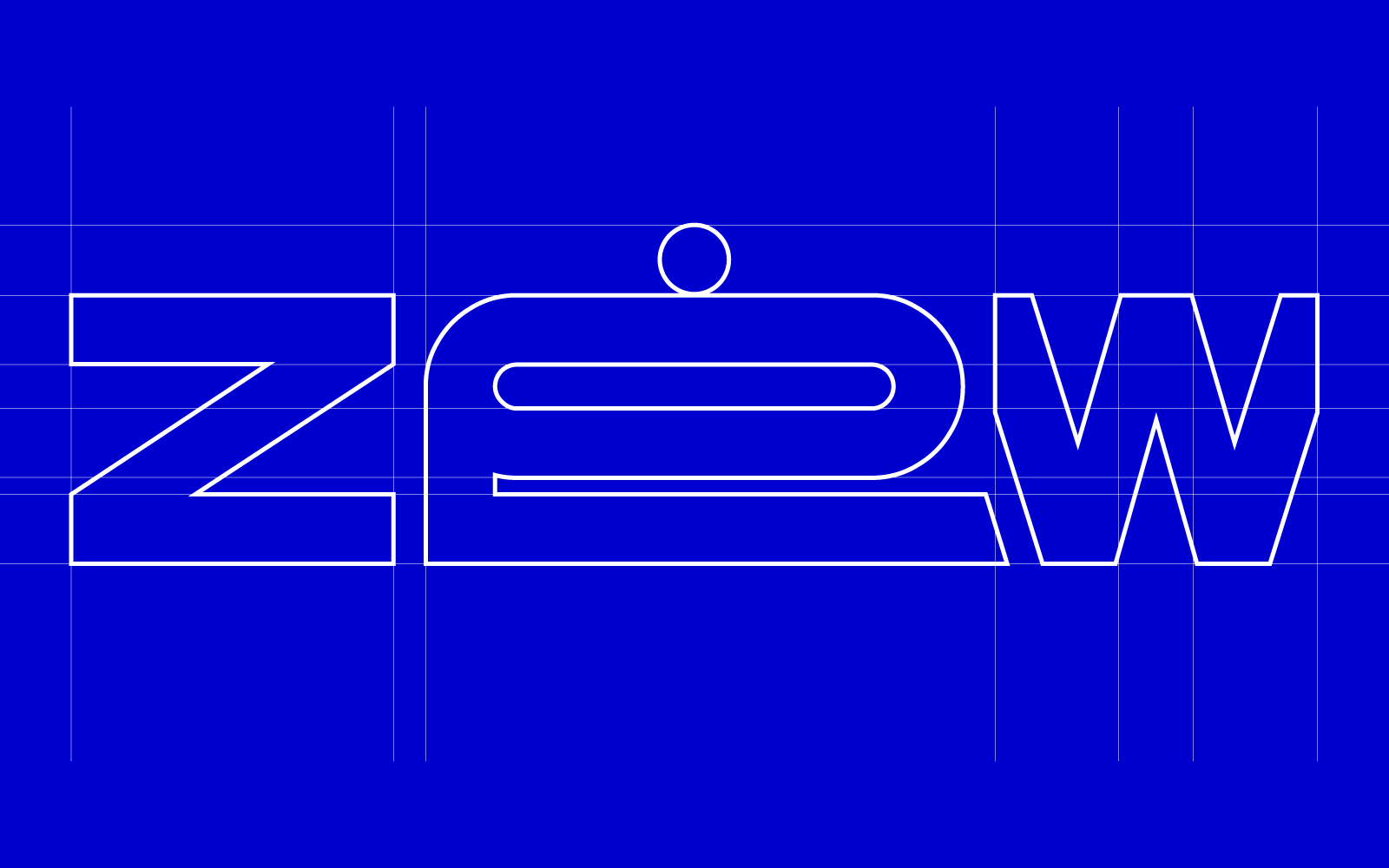
The solution was to make the typography do more than one job. At first glance, ZEW is simply a confident, geometric wordmark. But look closer, and the dot and horizontal stroke within the letter “E” form the unmistakable silhouette of a cloche.
The detail is quiet enough that it never interrupts the legibility of the wordmark. It doesn’t scream for attention, but once you see it, you can’t unsee it.
The best logo trick is the one you discover yourself.
Art direction: restraint and materiality.
The hidden cloche anchors an identity that runs across menus, signage, takeaway packaging and the venue itself. Everything around it is deliberately restrained: no graphic clutter, so the typography, the materials and the trick in the mark carry the whole personality.
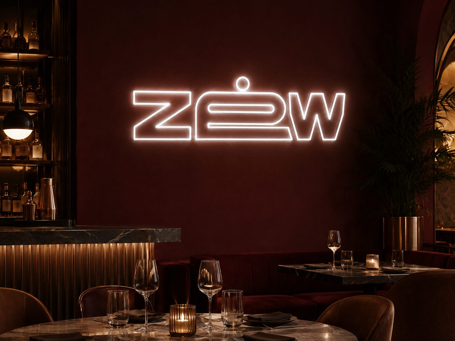
The impact: scale and discovery.
The same mark works on a printed menu and on the building facade, with no separate “small” and “large” lockups. From across the street it reads as strength; up close it rewards a second look.
That tension is the identity.