Expondo – Blackout Sale
Turning Black Week from a promotional event into a phenomenon.
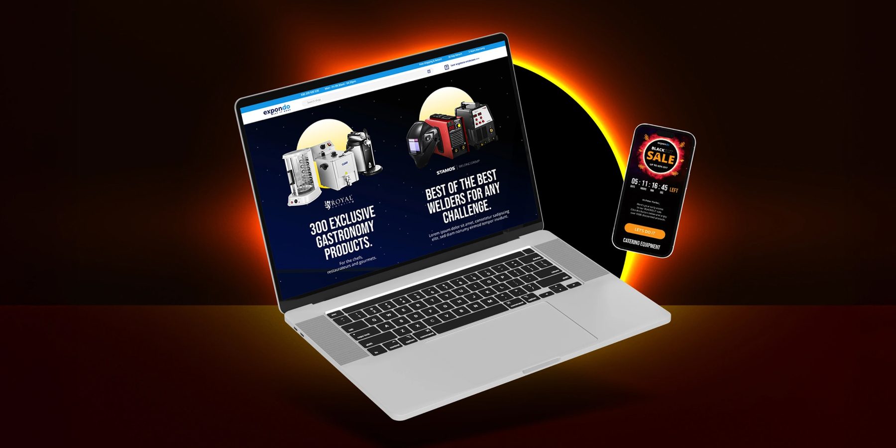
The challenge: a category built on noise.
Black Week is supposed to be exciting, but the category has turned it into visual wallpaper. Black backgrounds, red accents, and aggressive typography have become the default. Every brand tries to manufacture urgency in the exact same way, until urgency itself becomes impossible to notice.
Expondo needed to enter that environment without becoming just another voice in the crowd. The brief wasn’t about finding a more interesting way to communicate a discount. It was about finding an idea strong enough to separate the brand from the noise. That led to a simple question:

What if Black Week didn’t look like a sale at all?
The concept: engineered scarcity.
The answer was a solar eclipse. An eclipse is rare, recognizable, and impossible to ignore. More importantly, it naturally possesses the emotional qualities that retail campaigns try to fake: anticipation, tension, and genuine scarcity. The sense of urgency doesn’t need to be shouted because it is already built into the phenomenon – you know it will happen, peak, and eventually disappear.
This gave the campaign much more than a visual metaphor. It gave it a commercial architecture. Instead of treating Black Week as a single promotional blast, the sale was built around the natural progression of an eclipse.

The campaign architecture.
The light starts to disappear. This phase introduced the darker world, building anticipation before the main event.
The peak of the campaign. The palette and contrast were pushed to their most dramatic point to frame the core commercial moment.
The gradual return of light. This provided a natural visual resolution while extending the commercial opportunity beyond the main event.
Art direction: making light matter.
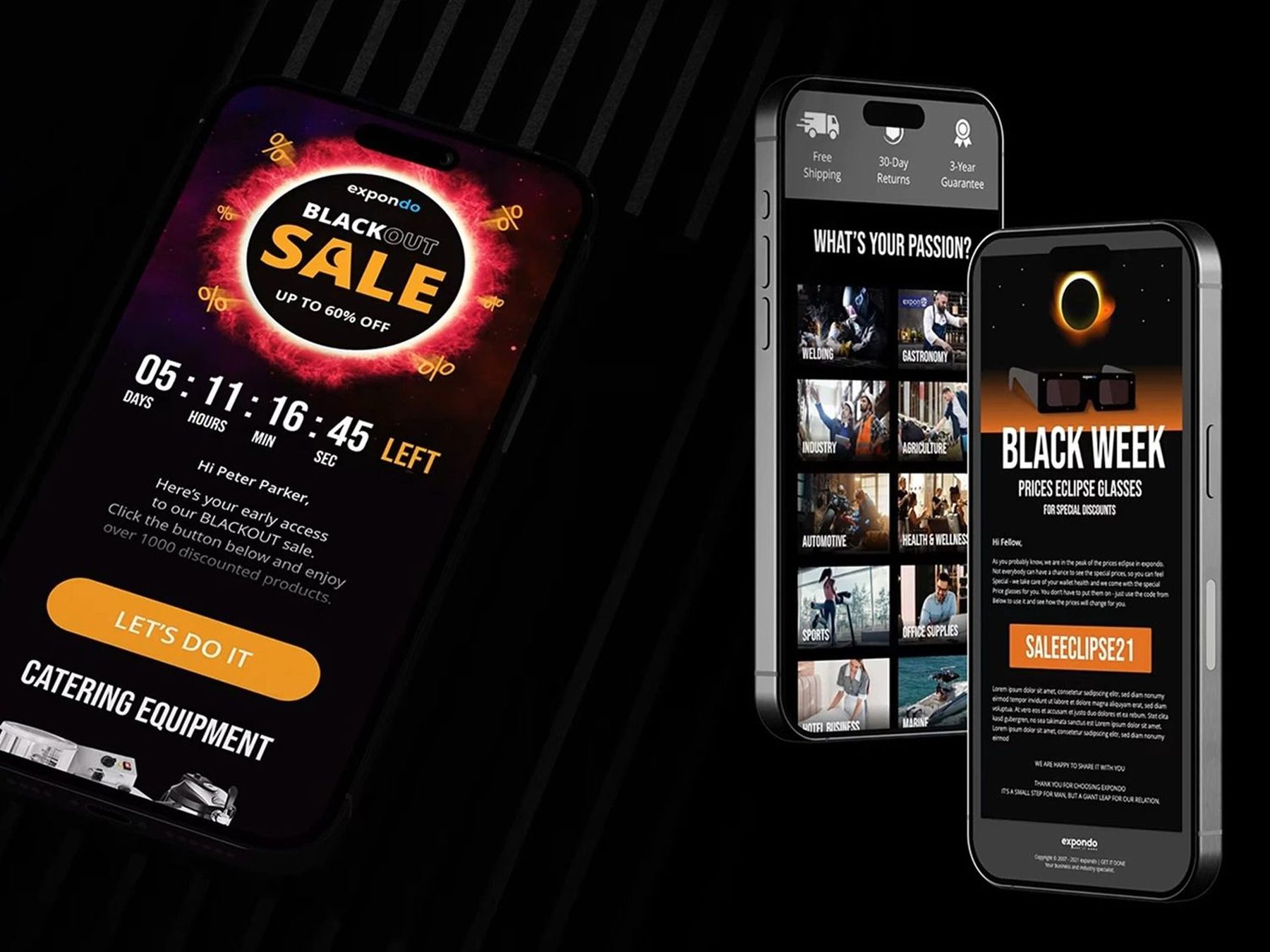
The visual language moved in the exact opposite direction of typical Black Friday clutter. Instead of filling every surface with loud promotional text, the compositions created space and contrast.
Built around deep blacks, controlled illumination, and sharp atmospheric flares, we created a world where light gradually became precious. Light became the focal point, darkness became the environment, and the reveal of the product or message became part of the unfolding event.

The design wasn’t simply inspired by a solar eclipse. It behaved like one.
The impact: from promotion to experience.
The solar eclipse wasn’t treated as a theme to decorate an existing promotion. It became the organizing principle behind the entire campaign – from the commercial calendar and customer journey to the motion design and landing page. Every interaction with Expondo felt like part of one unfolding event.
Expondo didn’t have to compete by being louder. They competed by being distinctive, giving a strictly performance-driven campaign a point of view strong enough to shape the entire customer experience.
The measure that mattered was performance, and it delivered. By treating Black Week as an event rather than just a discount, the campaign cut through the category noise and drove a +16% increase in year-over-year sales during the most competitive retail period of the year.
 +16%year-over-year sales