AZ Media
A bold and primal identity for ZEW — a restaurant brand where raw instinct meets refined design.
Branding
2021
Where It started
AZ Media is a PR agency built entirely on stories - shaping them, polishing them, getting them in front of the right people. The problem was that their own identity didn’t really say anything. It worked, technically, but it didn’t carry a point of view. They needed a brand that felt as confident and expressive as the work they do every day.
What I wanted to build
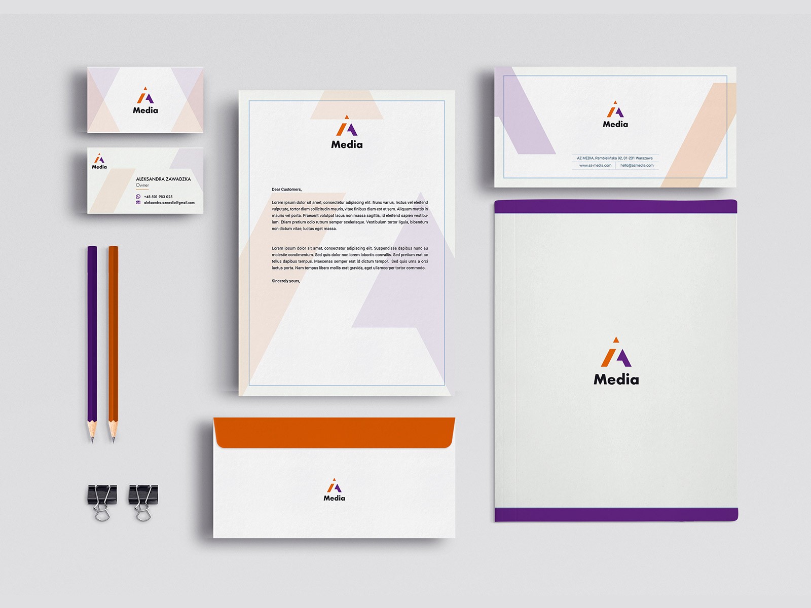
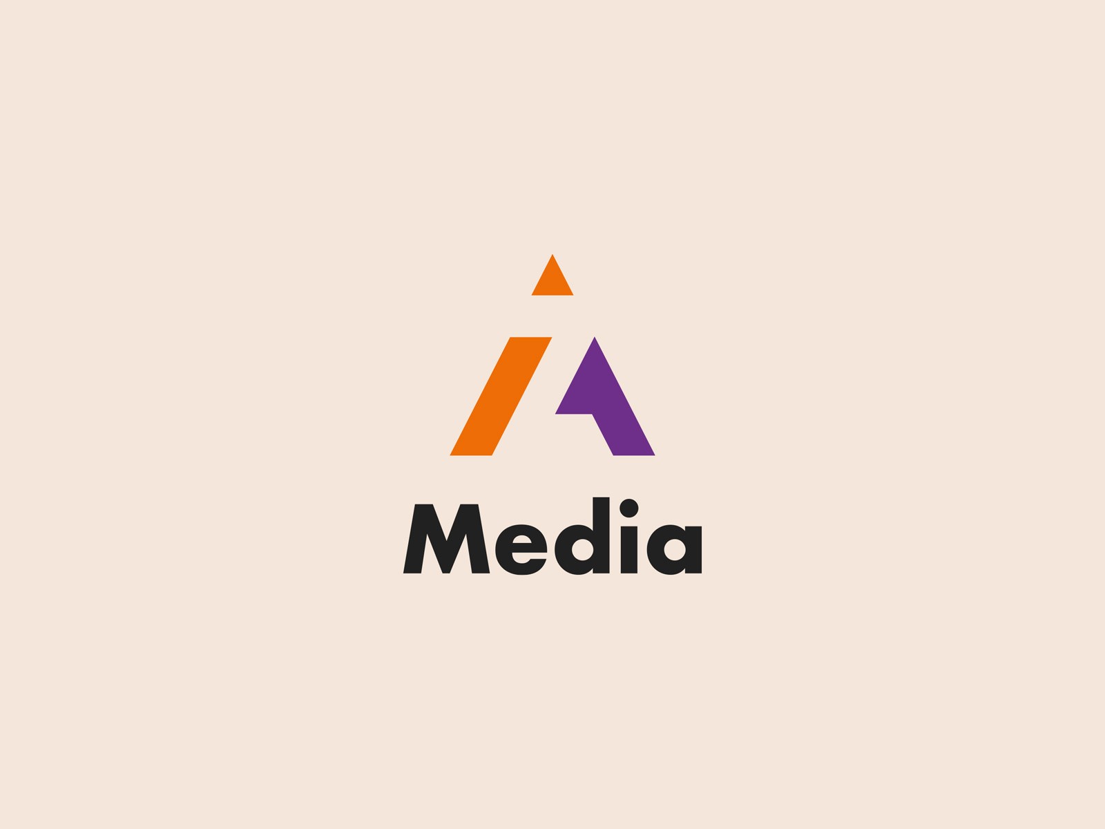
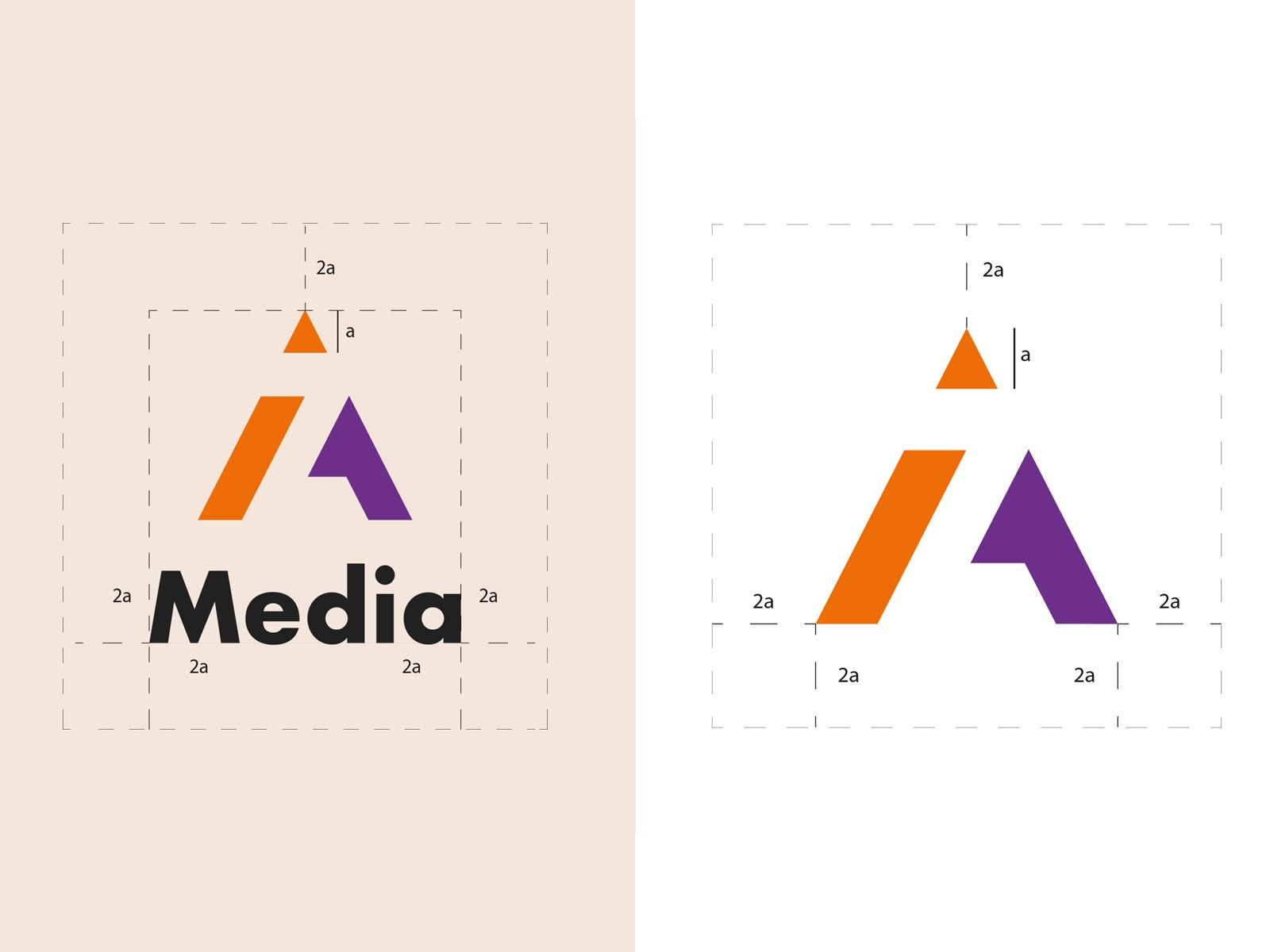
I wanted an identity that speaks in a single glance: bold, clear, and a little bit unexpected. Something that looks professional without falling into the “corporate blue” stereotype. The logo became the starting point — sharp angles forming the letter “A,” but also pushing upward, almost like an arrow. It felt like the right metaphor for visibility and momentum.
What I learned along the way
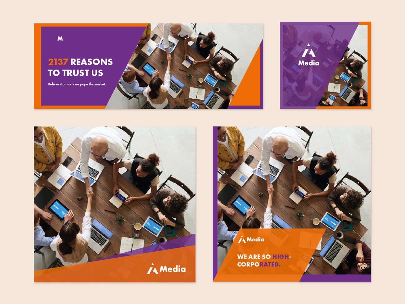
The color split - bright orange with deep purple - did most of the heavy lifting. Orange carries the energy and openness the agency works with, while purple grounds everything with a more strategic, authoritative tone. The typography stays calm and modern, letting the mark shine without competing with it. The whole system is built on contrast: warm vs. cool, dynamic vs. steady, expressive vs. precise. That tension is what gives the brand its personality.
What the work changed
The final identity feels sharp, modern, and unmistakably theirs. It stands out in presentations and still looks solid on something as small as a business card. It has the confidence of an agency that knows how to make things seen — and the restraint to stay clear and trustworthy. It doesn’t just label the company. It reflects how they work: direct, visible, and always pushing the story forward.