FIT13
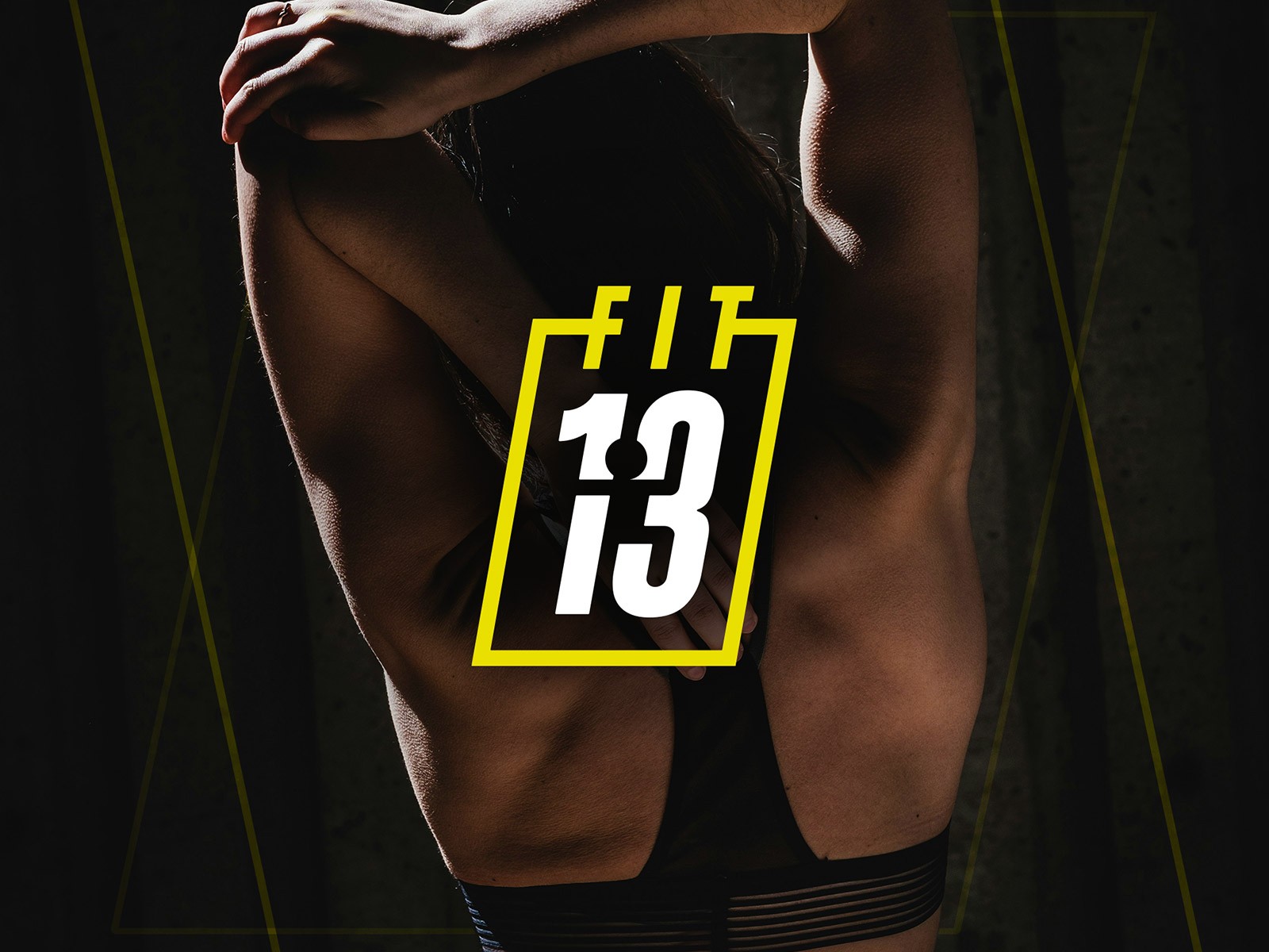
A bold and minimalist visual identity for FIT13 — a personal training studio that turns “13” into a symbol of strength, determination, and breaking limits.
Where It started
FIT13 wanted a brand that didn’t look like the usual gym stuff, all the neon, the shouting slogans, the predictable “push harder” mood. It felt tired. They needed something with strength, yes, but not the kind that screams at you from across the street. The brief was basically: make it feel modern, focused and bold, without falling into the clichés everyone else uses.

What I wanted to build
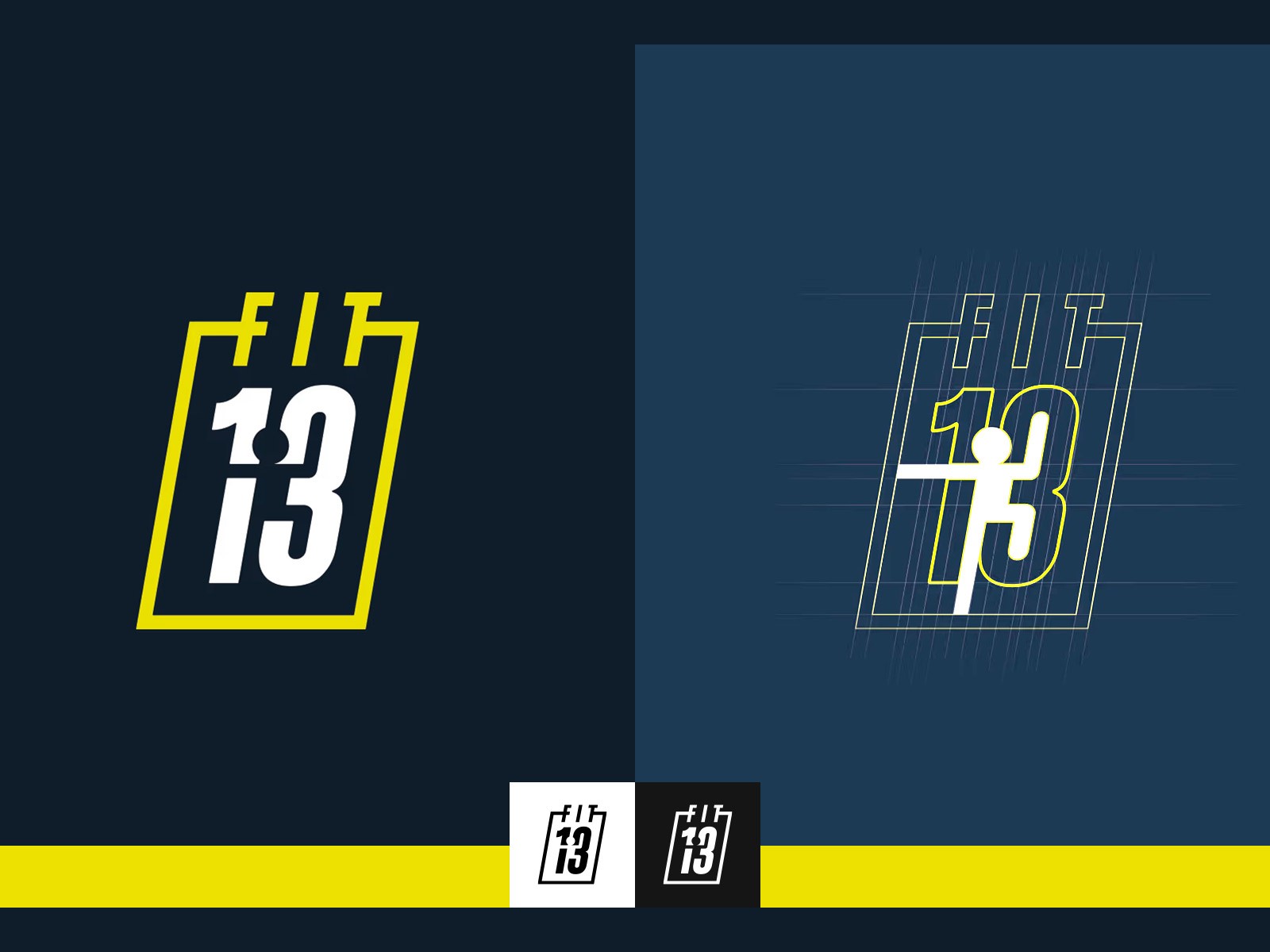
The number 13 became the anchor pretty quickly. Not the superstitious version, more like going one step further than you planned, pushing past your own ceiling. While sketching different versions of the number, I noticed there was enough space inside the shapes to hide a figure in motion. A tiny human form, almost abstract, but once you see it, it sticks. That became the core idea: a brand built around movement you can’t unsee once you notice it.

What I learned along the way
Fitness branding is a trap. If you try too hard to be “motivational,” everything starts looking the same. The trick here was to be confident without being loud. The more I pared things back - fewer effects, fewer visual tricks - the stronger the whole system felt. It shifted from “gym energy” to something calmer but more intentional. More like a mindset than a poster.

What the work changed
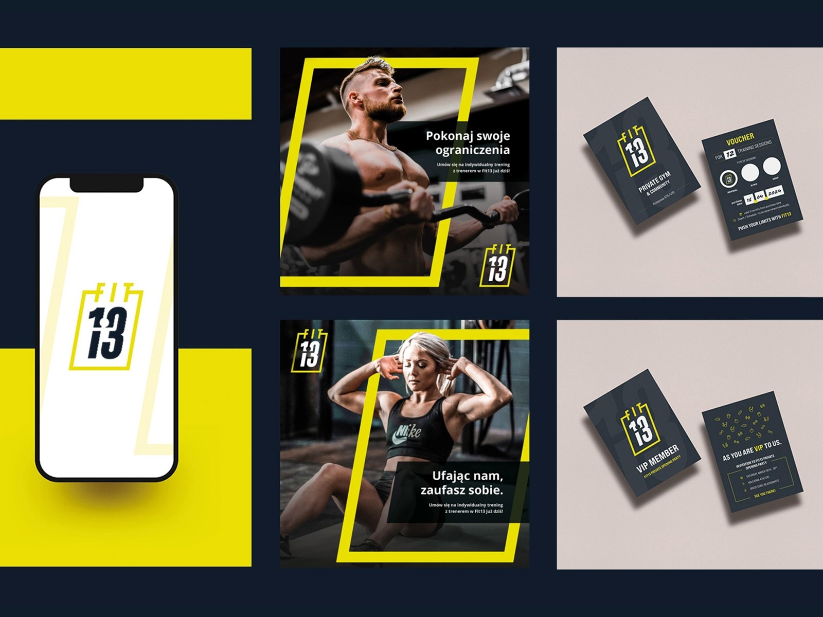
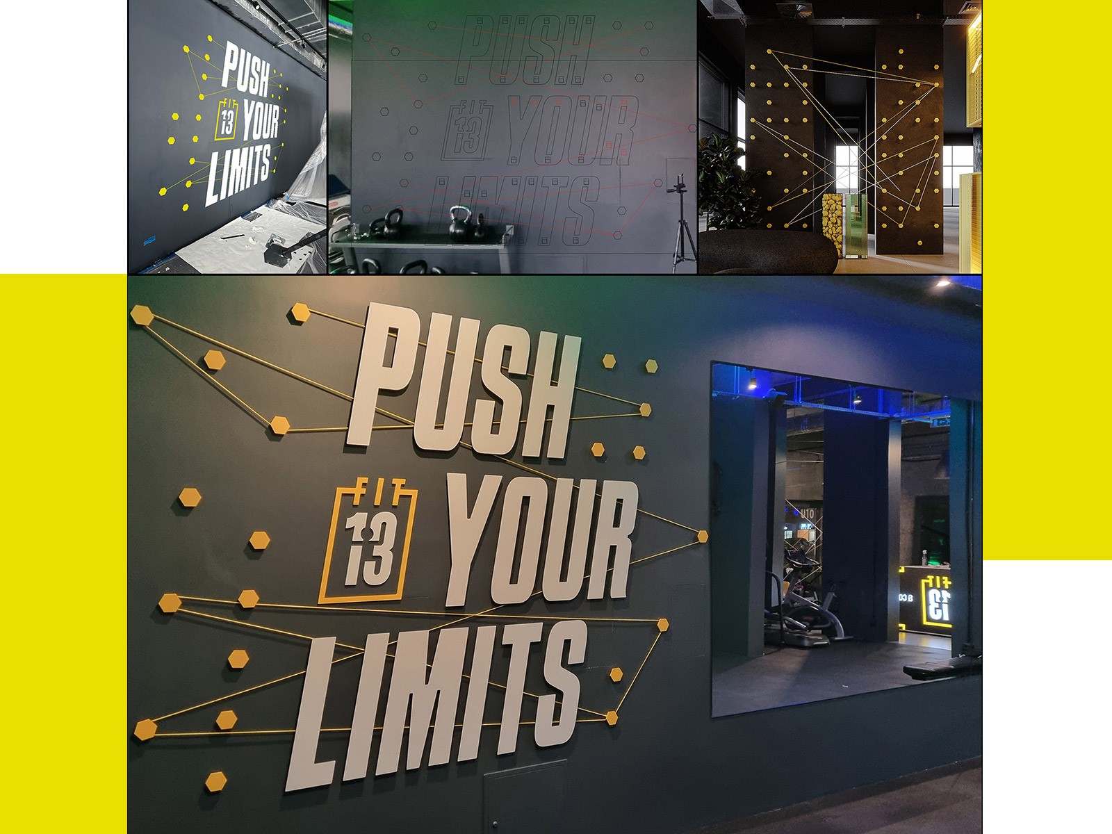
The final identity revolves around the “13” symbol and that hidden motion inside it. It works on apparel, signage, digital assets, even as a simple mark on the wall. Clean typography and a tight color frame keep everything consistent without making it feel rigid. It’s a brand that carries energy without overselling it. Focused, modern, easy to recognize - and finally different from the noise most gyms rely on.


