Lemanskills
UX and UI design for Lemanskills, creating a modernist digital presence where simplicity meets functionality.
Where It started
Lemanskills had strong content and a strong founder behind it, but the website felt like it had grown in layers over time. Blog, products, PCM, offers, podcast, leadership content – everything was there, but not everything was easy to find. Leaders landing on the site had to work too hard to answer simple questions: Who is she? What does she actually offer? Where do I start?

What I wanted to build
The goal was to turn the site into a calm, confident entry point into her world. Less “busy expert with a lot of stuff,” more “trusted guide who knows exactly how to help you grow.” I wanted three things to be obvious within seconds: who Aleksandra is, who she works with, how to work with her next. The redesign needed to make that journey simple for three main groups: individual leaders, teams and organizations. Different needs, one clear structure.
What I learned along the way
Digging through the existing pages and structure, one pattern kept showing up: the content itself was good, but the experience around it was noisy. Long blocks of text, similar sections repeated in different places, and calls to action that didn’t feel clearly prioritized. There was also an emotional mismatch: Aleksandra’s work is about clarity, communication and growth, but the site sometimes felt overwhelming. Once that clicked, the design direction became obvious — the website had to behave like her work: structured, clear, and focused on what actually matters.

What the work changed
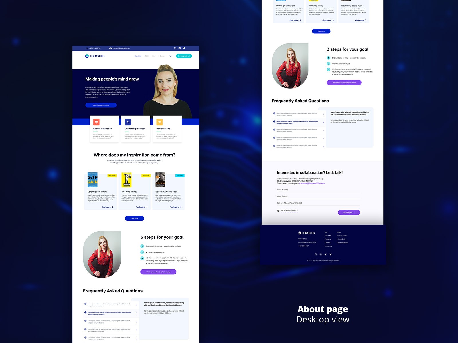
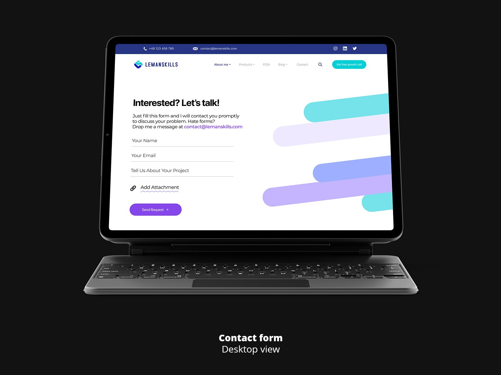
I rebuilt the site around a much simpler story: Who she is → What she does → How you can start. The navigation was cleaned up, sections grouped by intent (About, PCM, Products, Blog, Podcast, Leadership Pulse), and each page got a clear primary action: book a call, learn more, explore a specific program. Layouts shifted from heavy text to more breathable blocks: short intros, scannable benefits, social proof, and consistent visual patterns that are easy to reuse as the brand grows. The result is a site that feels lighter, faster to understand, and more aligned with her positioning as a leadership and communication expert — not just someone with “a lot of content,” but someone with a clear path for the people she works with.