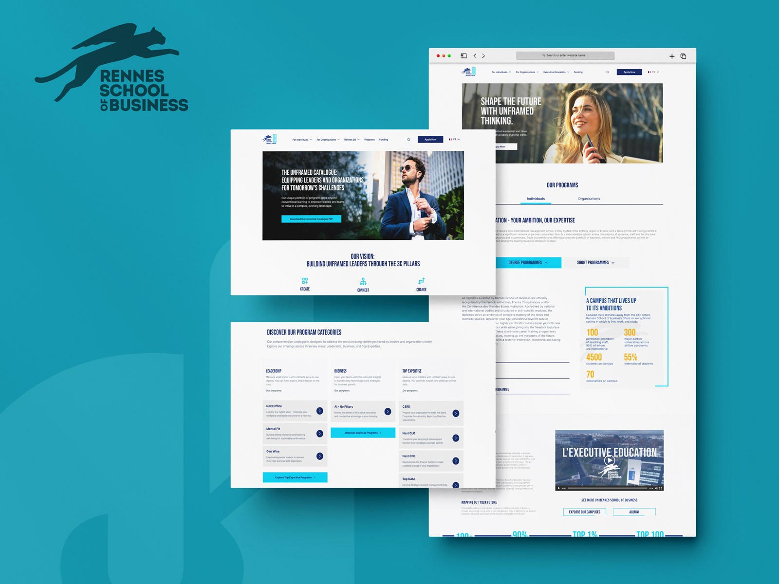
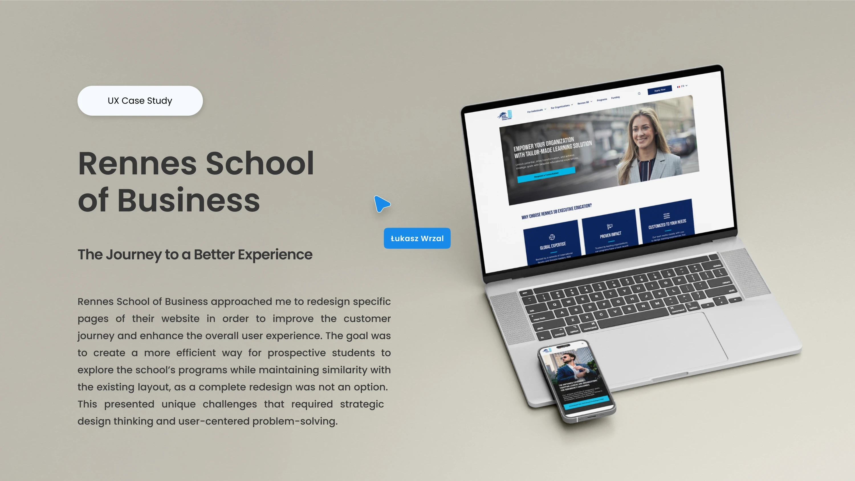
Rennes School of Business
A complete redesign of Rennes School of Business’ website — creating a cleaner, smarter, and more user-friendly digital experience.
Web Design
2024
Where It started
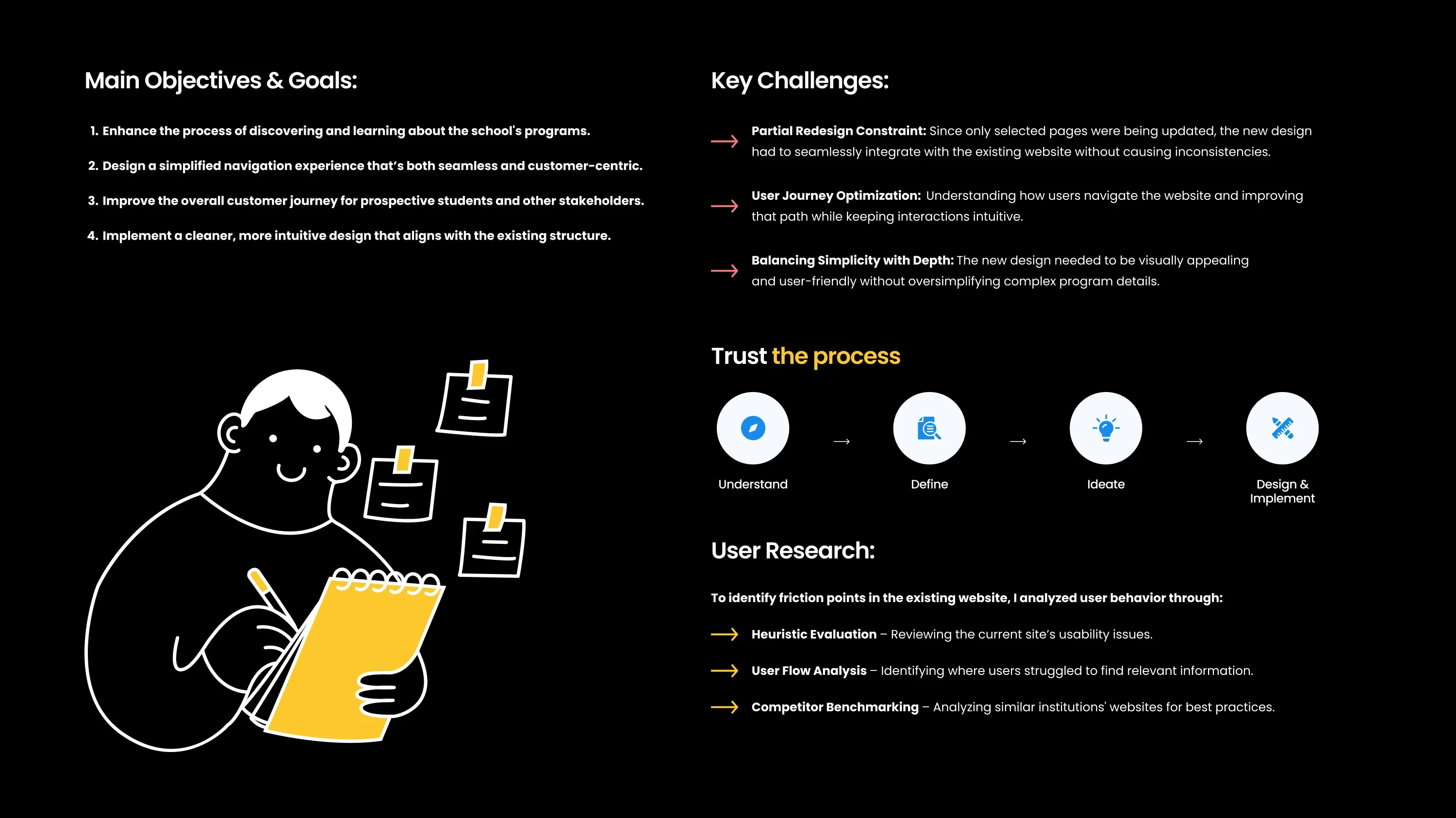
The original Rennes SB website was trying to do everything at once — too many colors, too many layouts, and way too many paths to reach even basic information. Students had to click around just to understand what the school actually offered. Nothing was broken in a dramatic way, but the whole experience felt heavy and confusing.
What I wanted to build
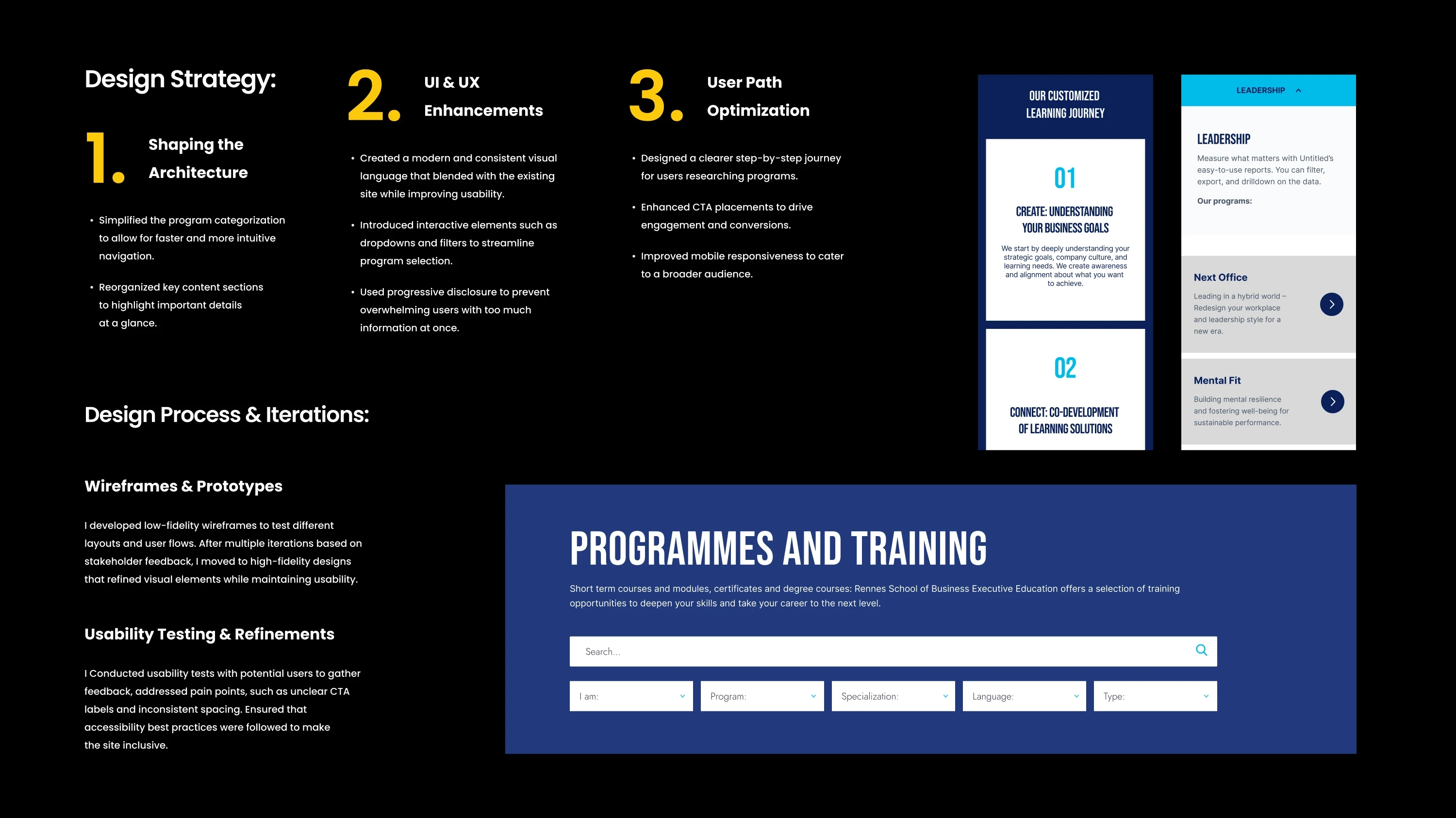
The goal wasn’t to decorate the site. It was to clear the air. I wanted a design where users didn’t need instructions to navigate, where programs were easy to compare, and where the school’s identity came through without shouting. That meant fewer colors, calmer layouts, better type, and a structure that lets people find what they need without feeling like they’re digging through a brochure scanned in 2012.
What I learned along the way
Digging into analytics and user interviews made one thing obvious: students weren’t struggling with what the school offered, but where the information lived. The navigation was split, naming was inconsistent, and similar pages behaved differently. Once you see that pattern, the redesign becomes less about visuals and more about respect, respecting people’s time, attention, and mental load.
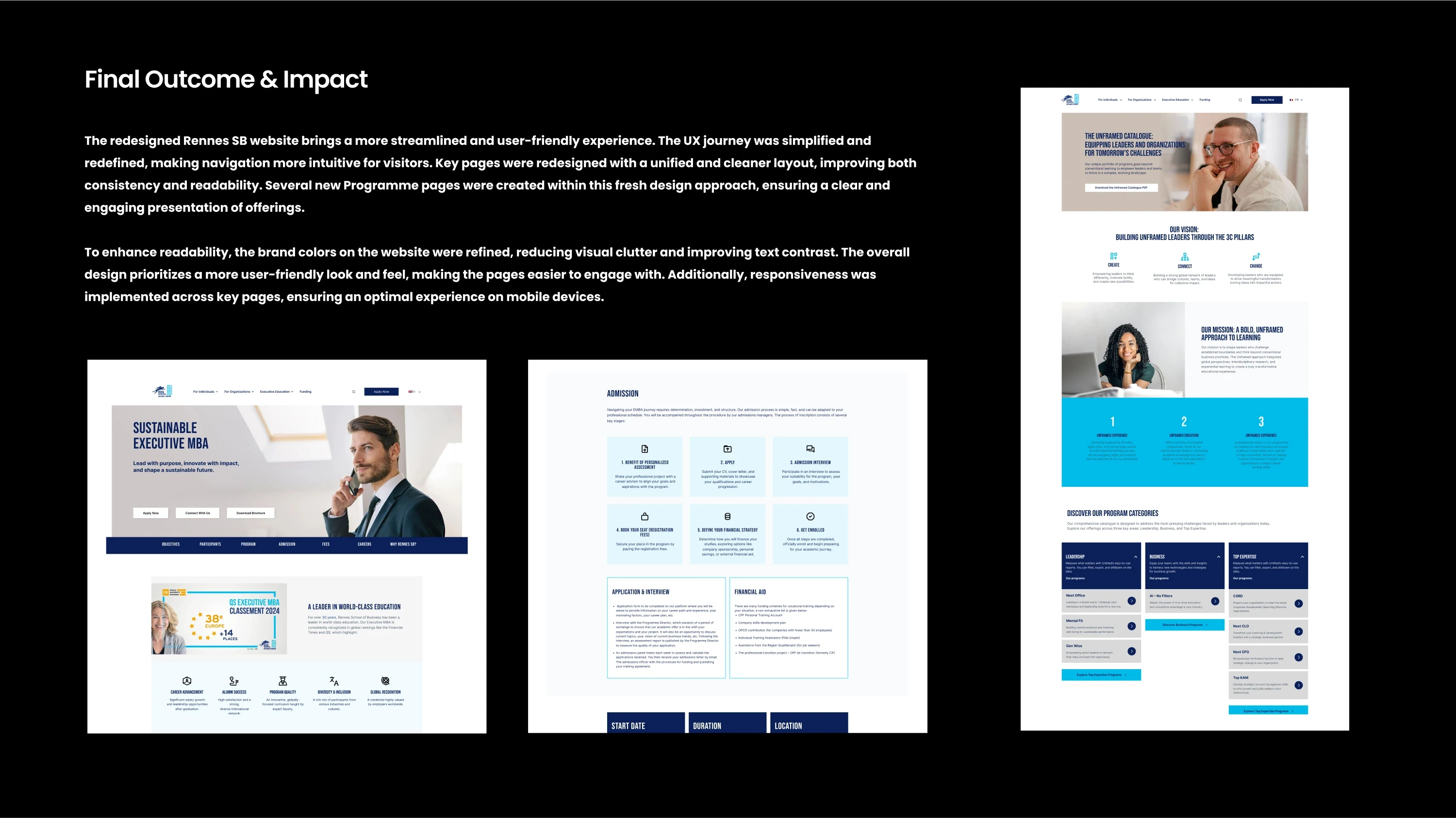
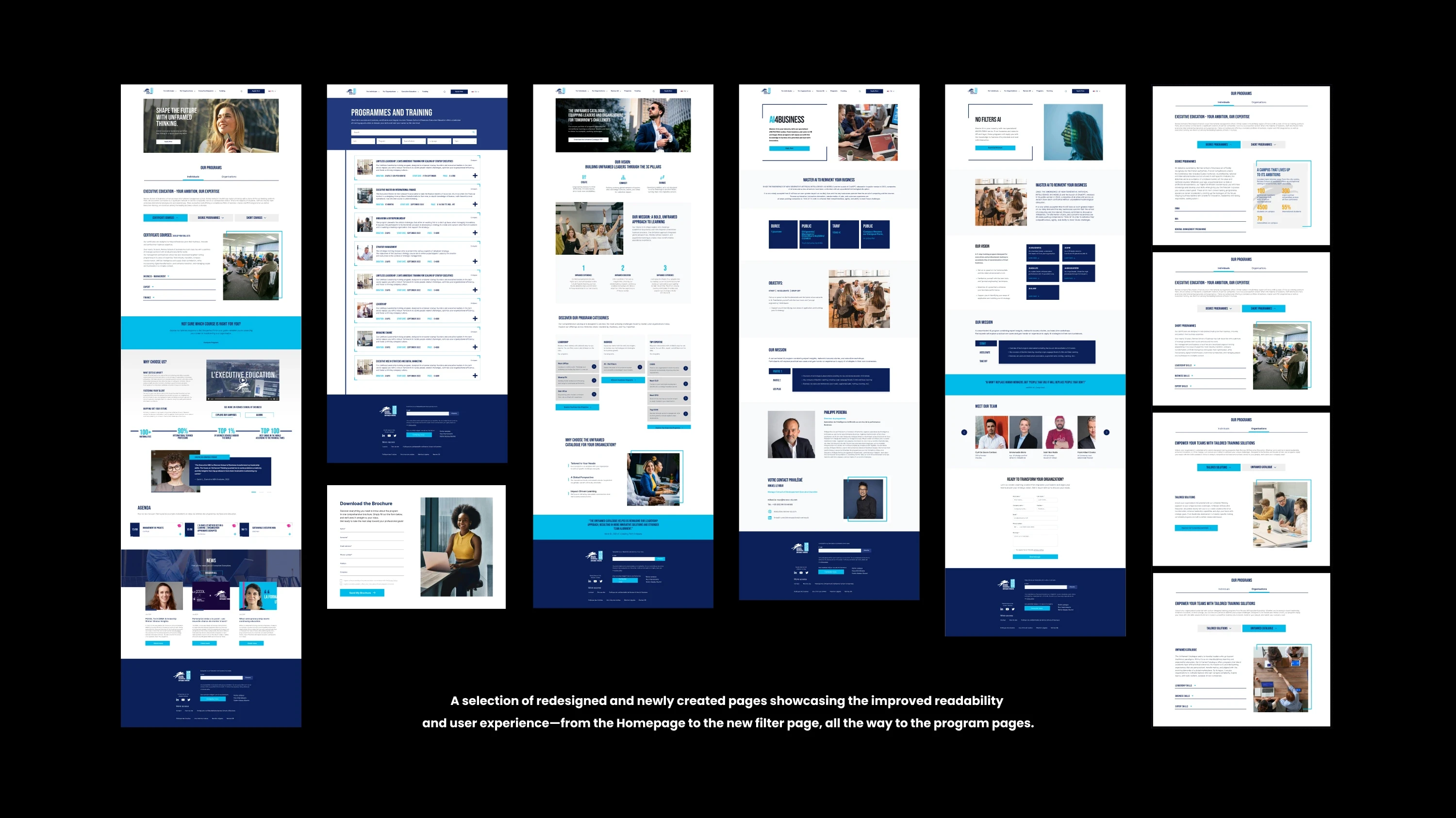
What the work changed
The new system uses a reduced palette, cleaner grids, and typography that actually breathes. Whitespace does most of the heavy lifting. Filtering was rebuilt so students can move through programs without hopping between tabs. Accessibility wasn’t treated as an afterthought, contrast, spacing, and structure were tuned from the start. The result is a site that feels calmer, clearer, and easier to navigate. For visitors, it means faster decisions and less friction. For the school, it’s a digital presence that finally matches the level of the institution.