Zew
A bold and primal identity for ZEW — a restaurant brand where raw instinct meets refined design.
Branding
2023
Where It started
ZEW wasn’t just another restaurant looking for a logo. It was a place built on two instincts pulling in opposite directions: raw, primal energy and quiet, modern refinement. The earlier concepts didn’t capture that tension at all. They were either too rustic or too polished. The brand needed something sharper; an identity that held both worlds without collapsing into cliché.
What I wanted to build
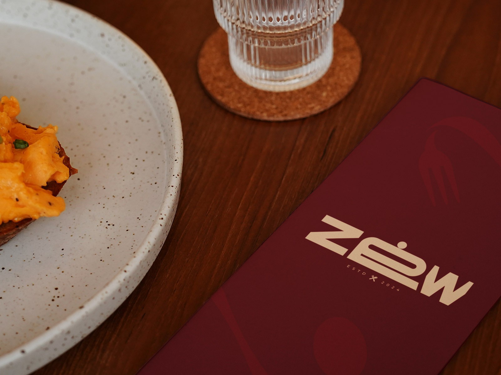
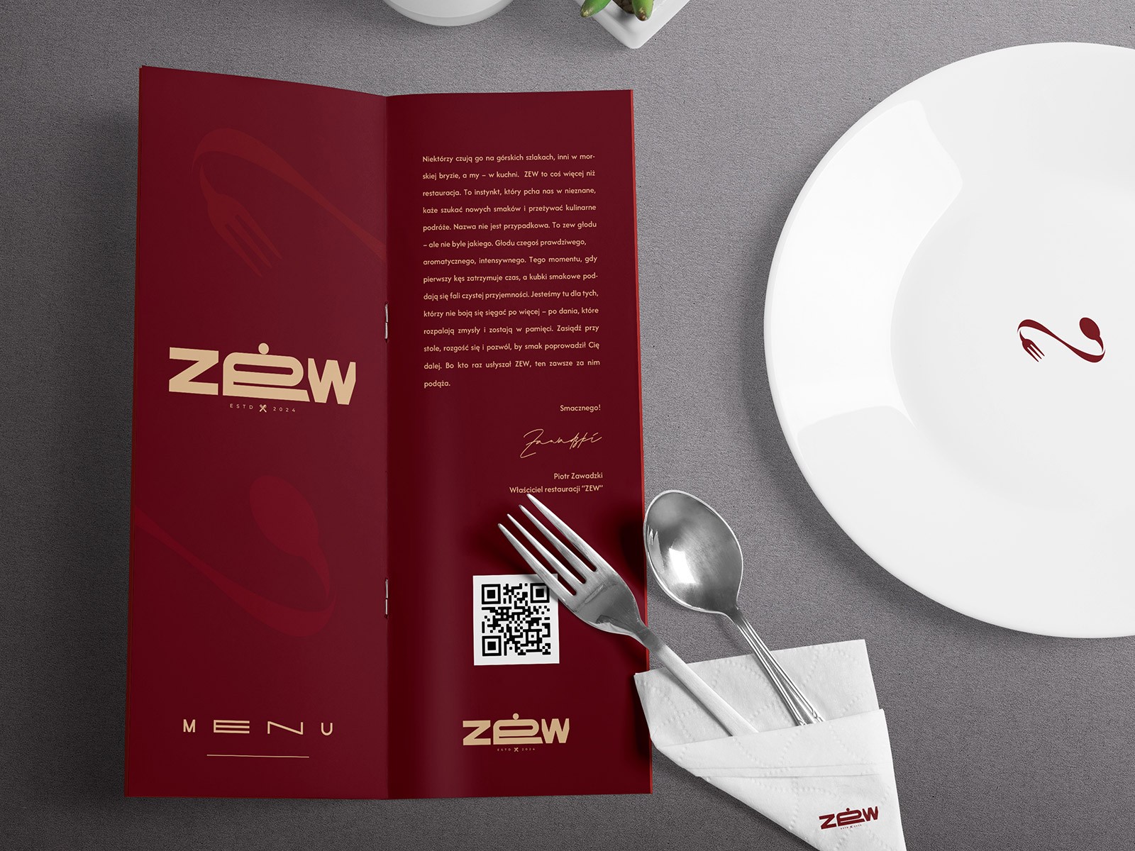
The idea was simple: a brand that feels strong the moment you see it, but rewards you when you look closer. No roaring animals, no fake brush textures, no “premium gold.” Just a confident mark with a subtle wink toward fine dining. The kind of identity that works on a heavy menu cover, a neon sign, or a tiny sticker on a takeaway bag - always recognisable, always in character.
What I learned along the way
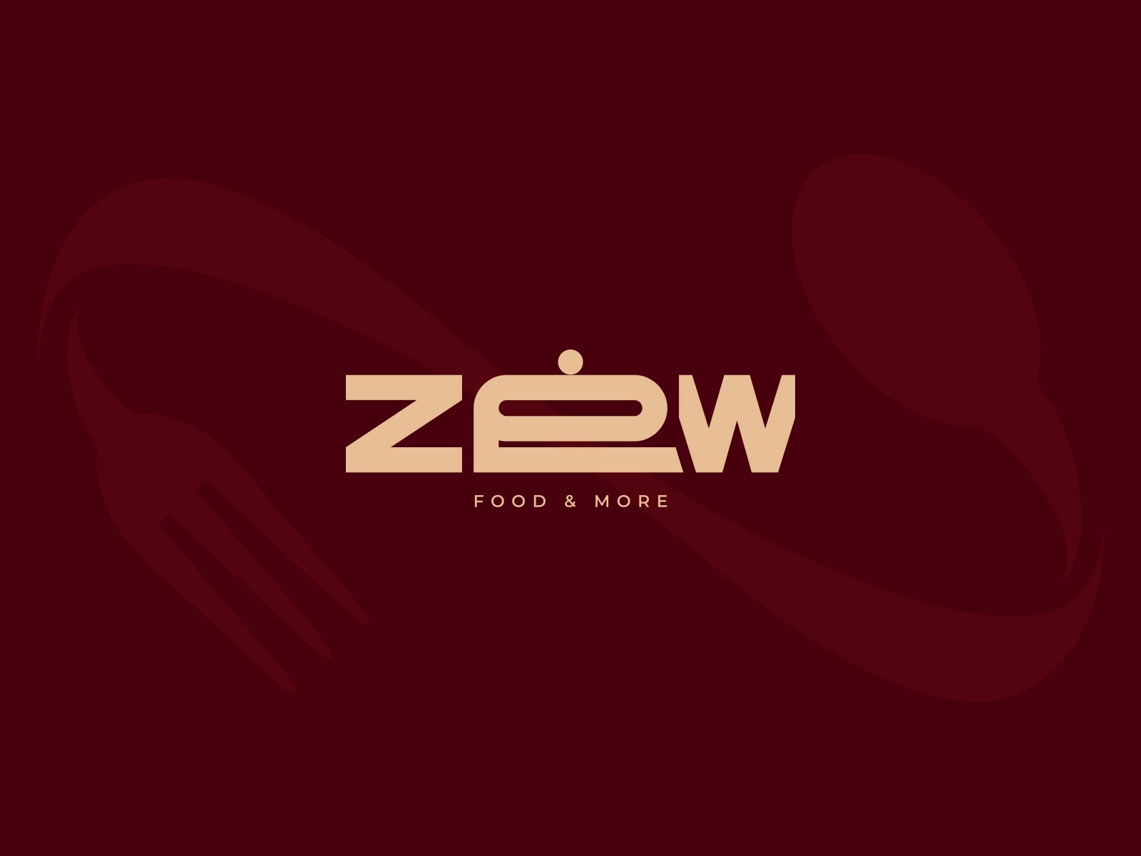
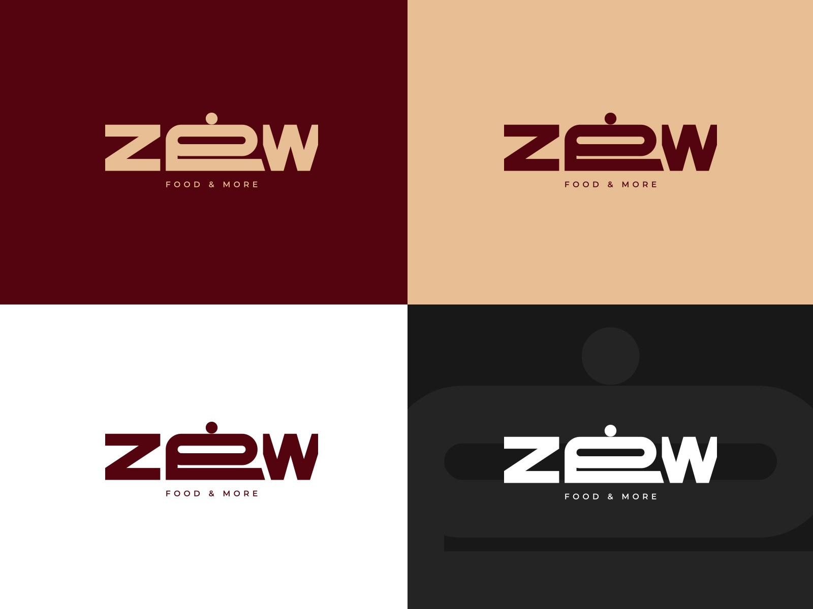
The turning point was the logo. A bold, geometric wordmark that stands its ground, balanced with a small detail that changes everything: the dot and horizontal stroke in the “E,” forming the silhouette of a cloche. It’s quiet. You notice it a few seconds later. But once you do, the whole brand clicks. The palette went toward deep, earthy reds and warm neutrals, not loud, not sterile, but grounded. Layouts stayed minimal, letting typography and texture carry the message rather than decoration.
What the work changed
The final identity gives ZEW a voice that’s both strong and controlled. Menus, signage, packaging - everything follows the same principle: clean forms, confident tone, nothing unnecessary. The brand feels modern without losing warmth, and primal without feeling rustic. ZEW now has an identity that doesn’t just decorate the restaurant, it shapes the entire experience the moment someone walks in.