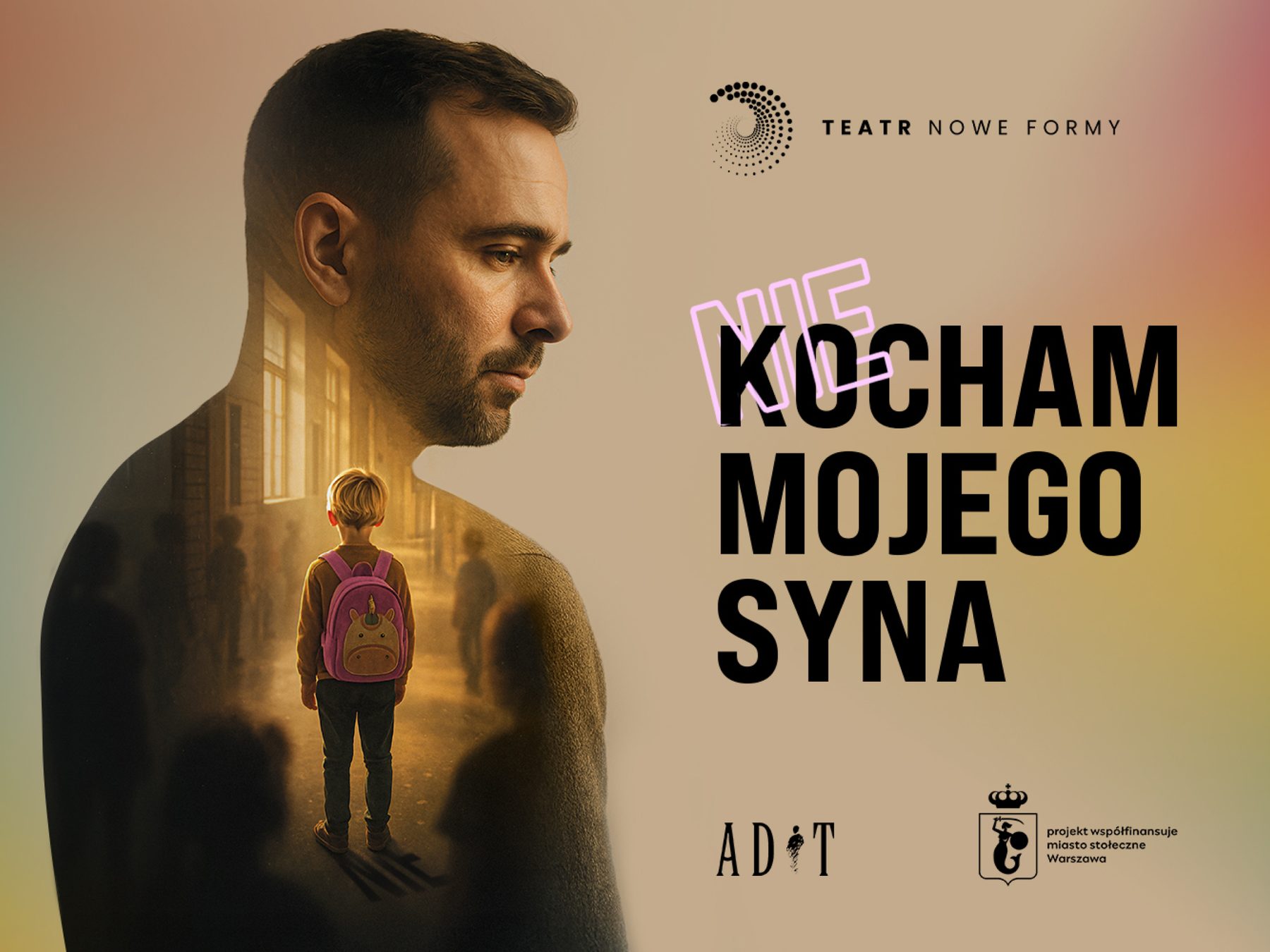
The challenge: a fragmented stage.
The theatre was full of different worlds, but visually, the promotional materials lacked a unifying thread. Because productions were being designed as isolated, one-off jobs, every premiere looked completely different. As a result, the theatre’s own identity was disappearing behind its plays. They needed a visual advisor to step in, guide the narrative, and give vastly different theatrical productions a recognizable, unified home.
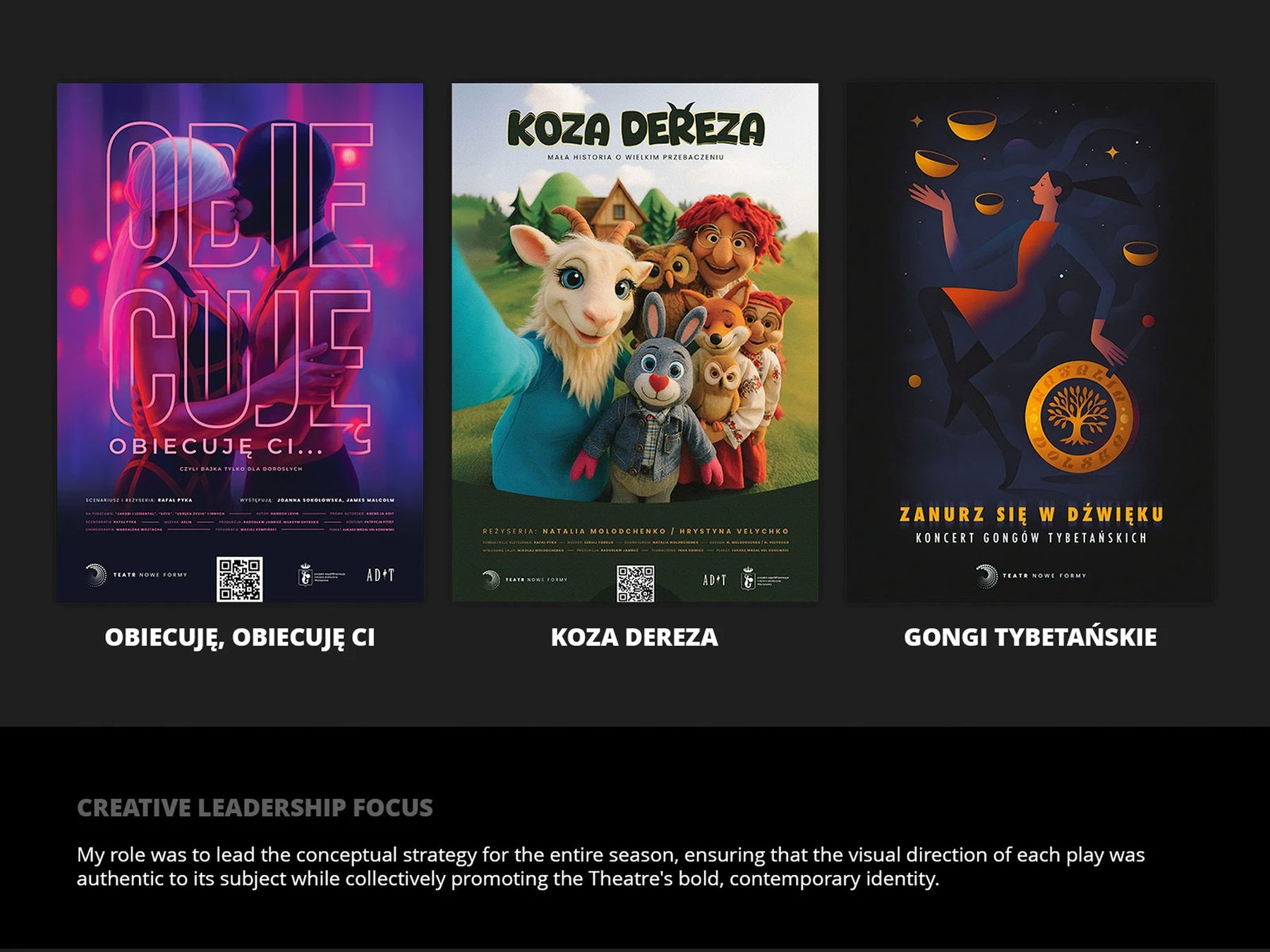
The concept: emotional flexibility.
The promotional materials needed to behave like the theatre itself. Some productions are quiet and restrained; others are visceral, absurd, or surreal. The design system had to be able to flex emotionally to accommodate these extremes without the theatre losing its own distinct accent.
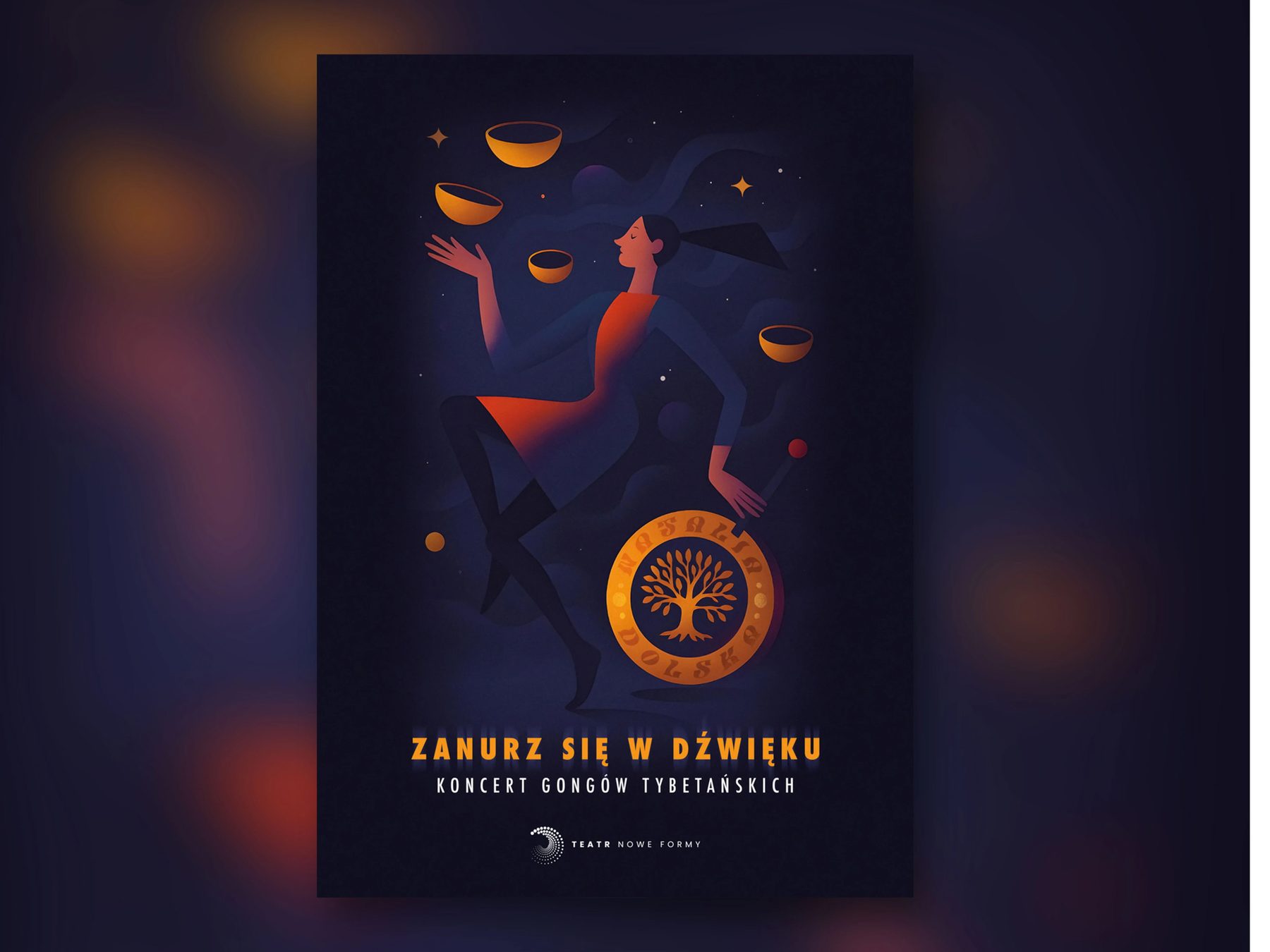
Consistency shouldn’t mean making every performance look like the same performance.
Art direction & execution: the stage, not the play.
I stepped in to provide visual support and art direction for the theatre’s performances. The role covered everything a production needs in order to be seen: all the performance posters, printed brochures, new business cards, B2B pitch decks for partners, and short-form video assets for the website.
Graphic decoration was stripped back wherever possible so the production could speak first. Photography, typography and composition do the storytelling, and they flex with the mood of each play.
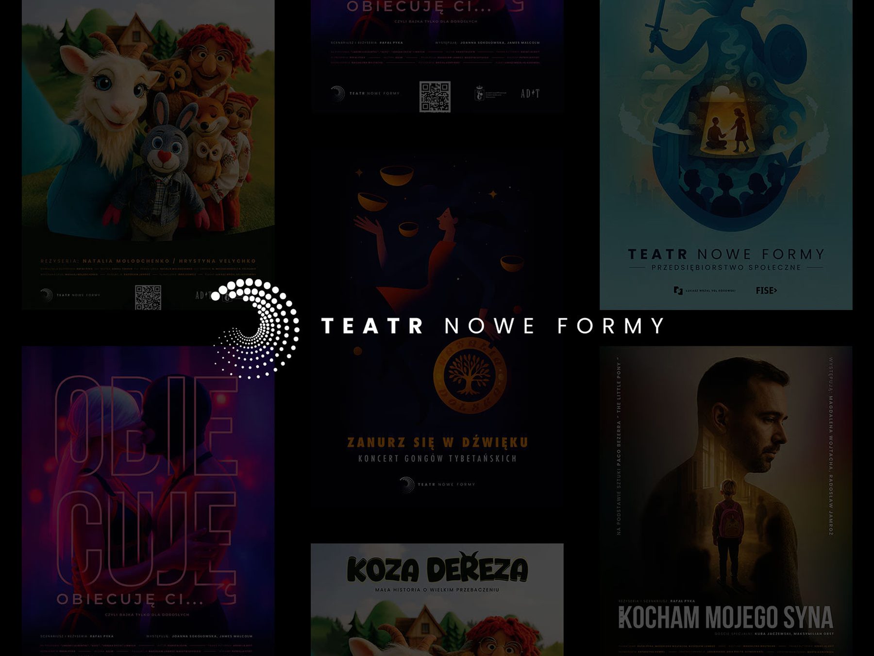
The motivation: designing with purpose.
I took on this role entirely on a pro bono, volunteer basis. I have a deep personal sentiment for the theatre and believe strongly in the arts. The aim wasn’t a design system for its own sake. It was to give a cultural institution the kind of visual support that lets the art take center stage.